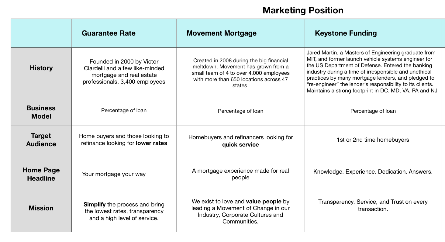
Keystone Funding
Mortgage Lending Company
I overhauled Keystone’s user experience into friendly, easy-to-use digital interfaces. The process consisted of a website and multiple tool redesigns aimed to empower borrowers through their home-loan journeys.
Website Redesign
For desktop & mobile
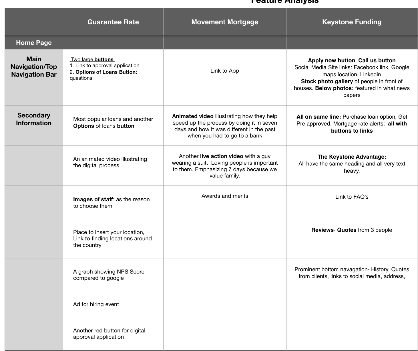
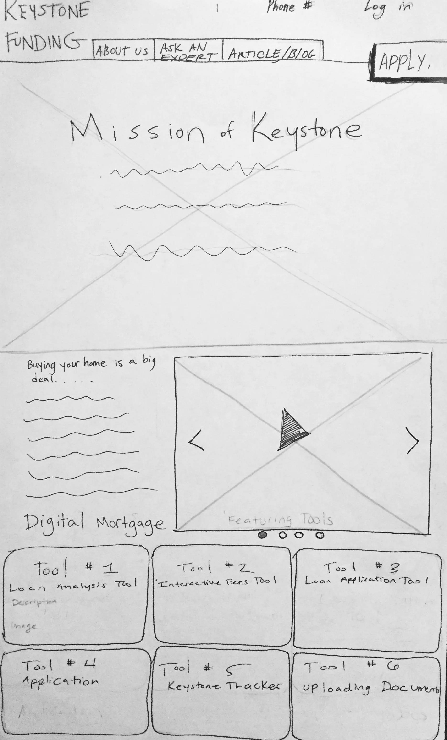
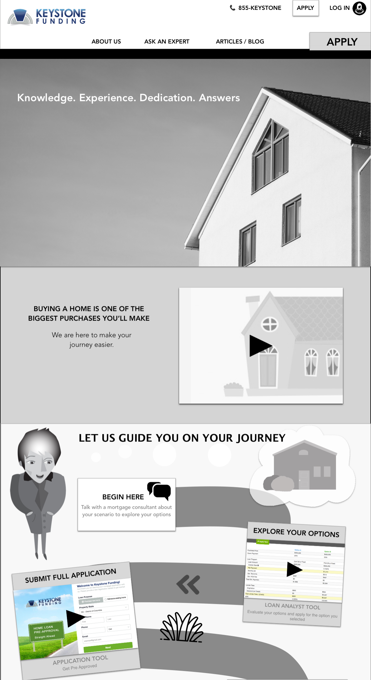
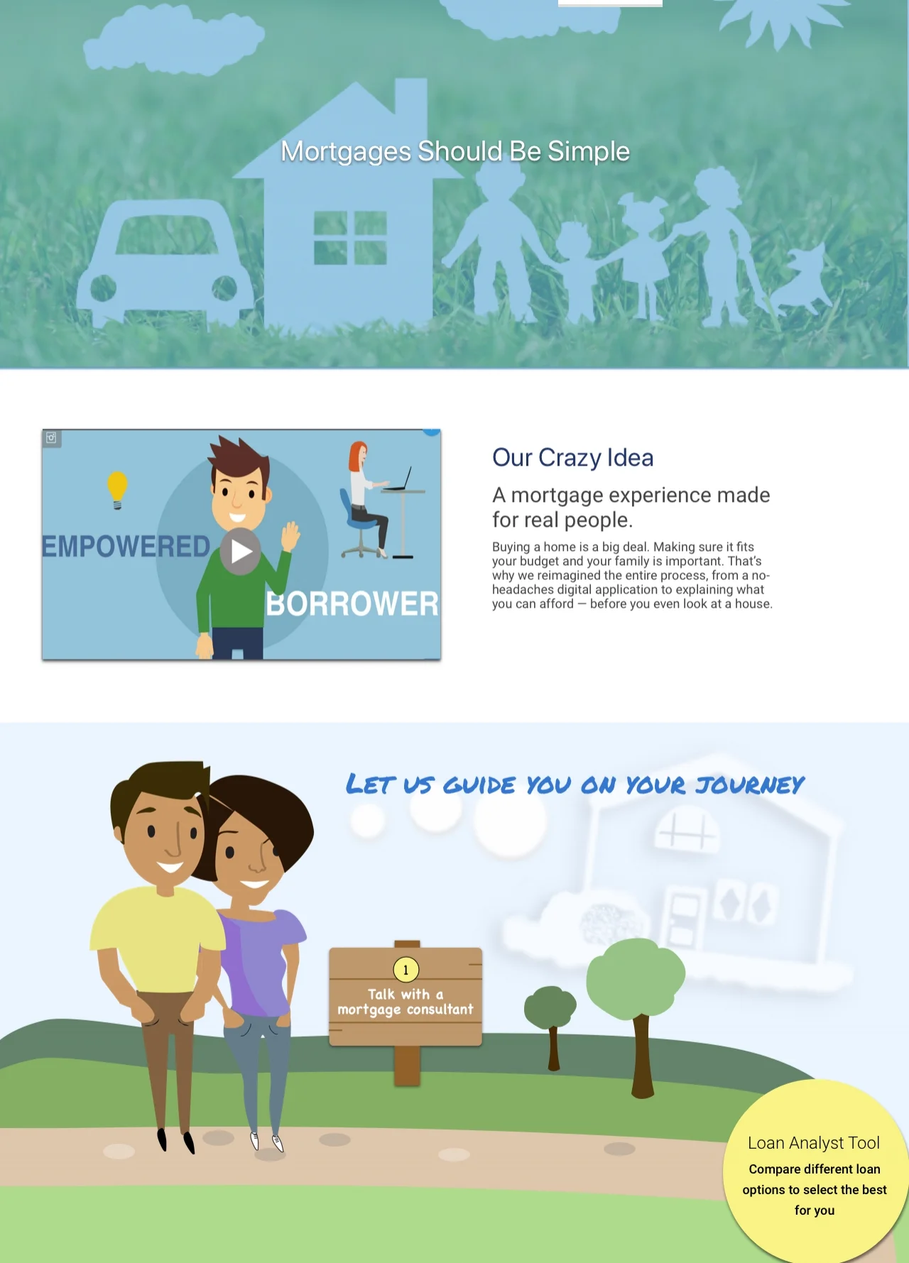
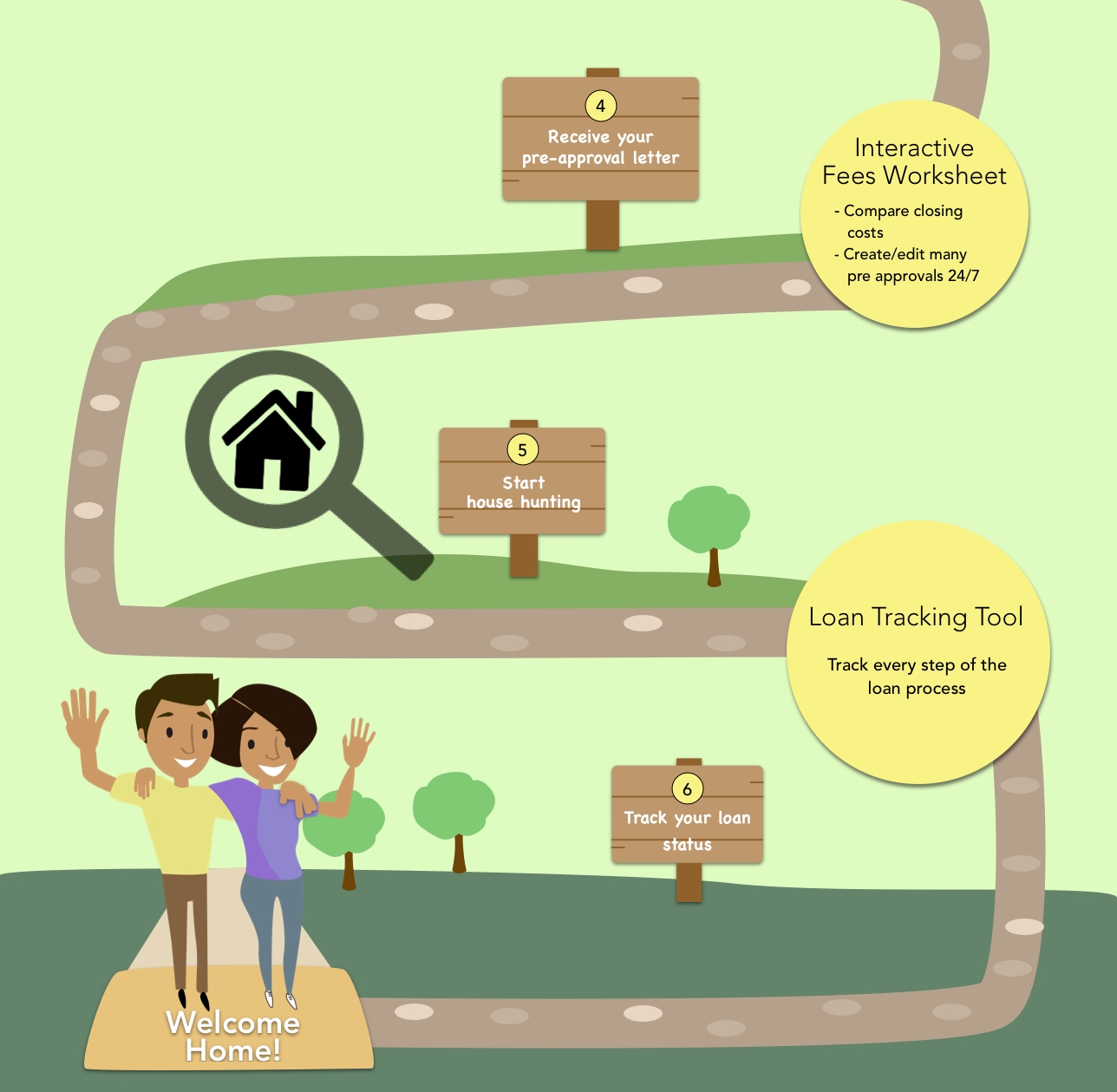
Problem:
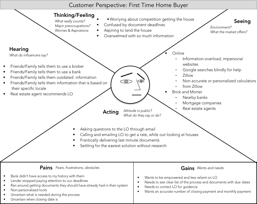
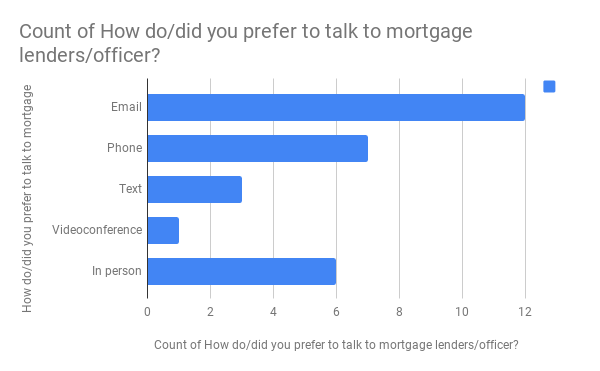
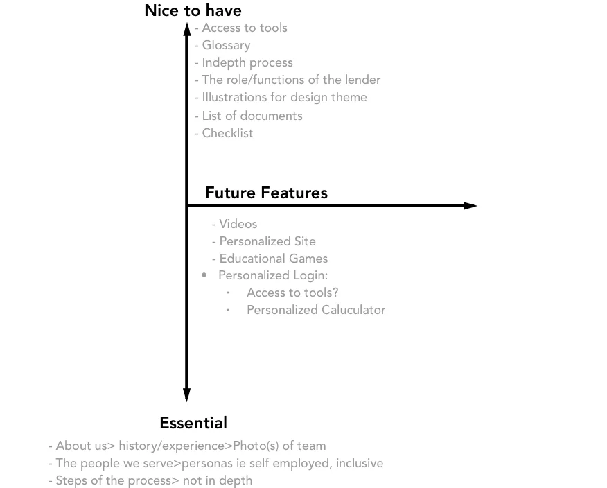
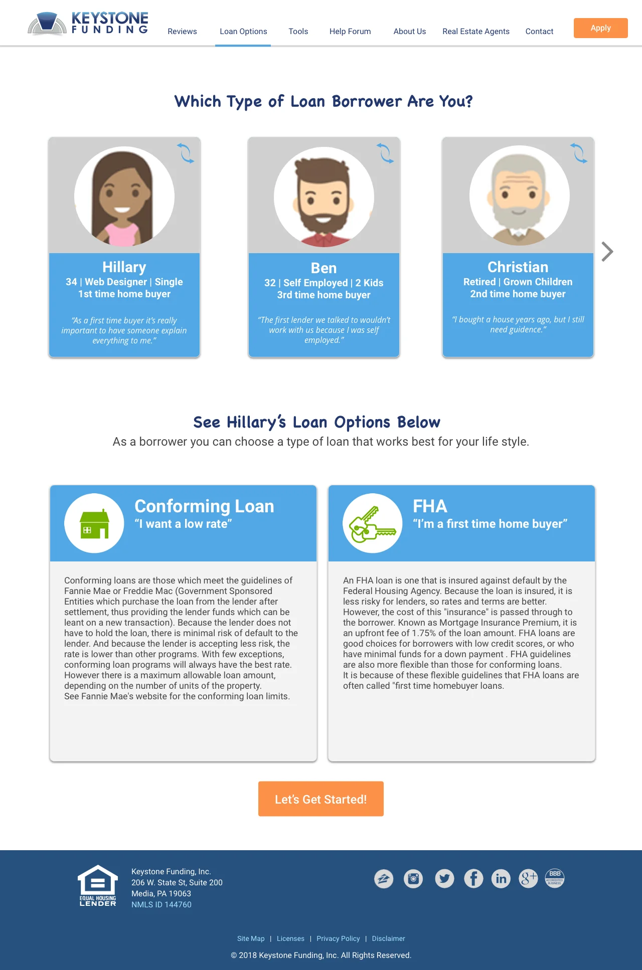
Users want to be educated on the home loan process but are overwhelmed with too much information that doesn’t connect with them.
Solution:
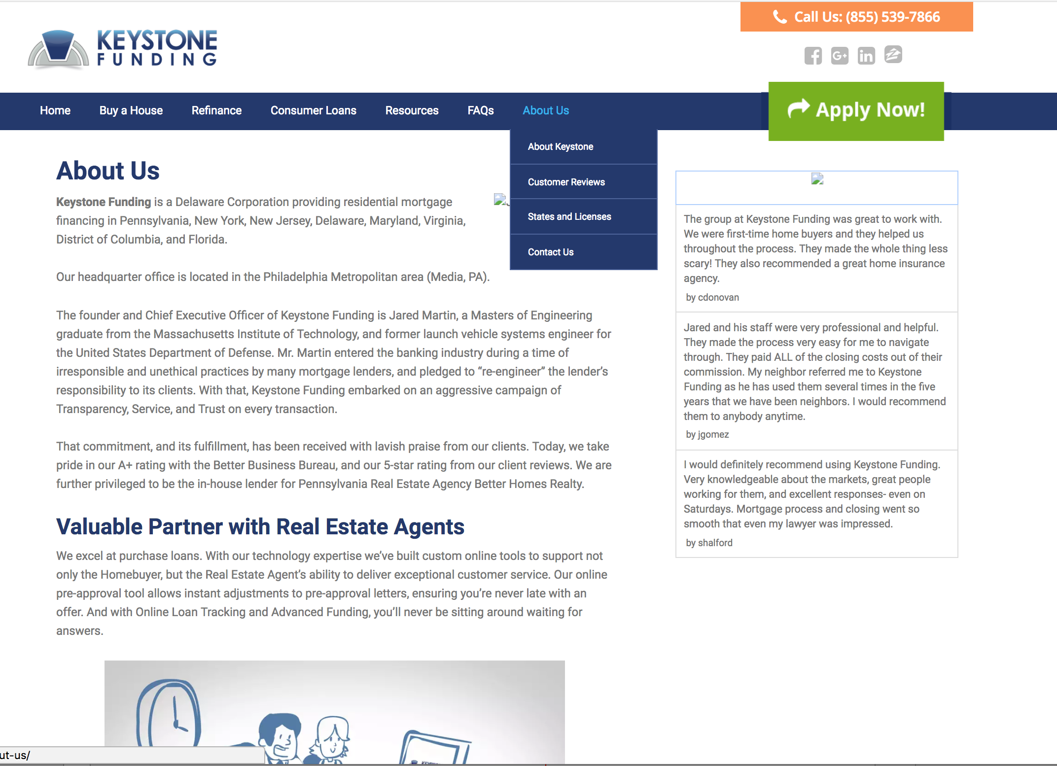
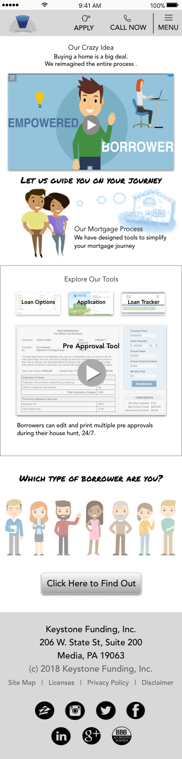
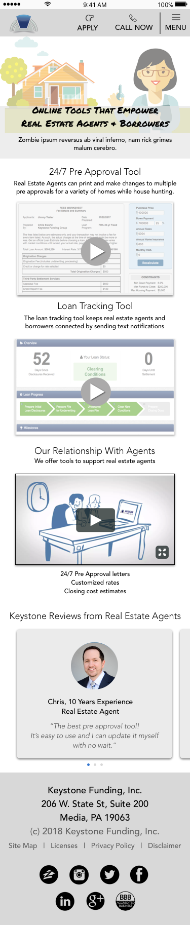
Designed a friendly, user-focused website that speaks to borrowers as well as real estate agents, adding:
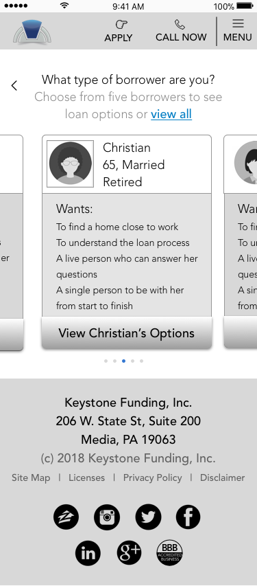
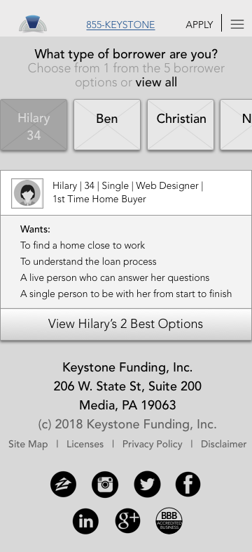
A persona-based loan options page where users can chose a persona that relates to them to see a couple potential loan options.
A real estate agent page since agents are the biggest business asset.
An illustrated, step-by-step process, educating borrowers through their home loan journey.
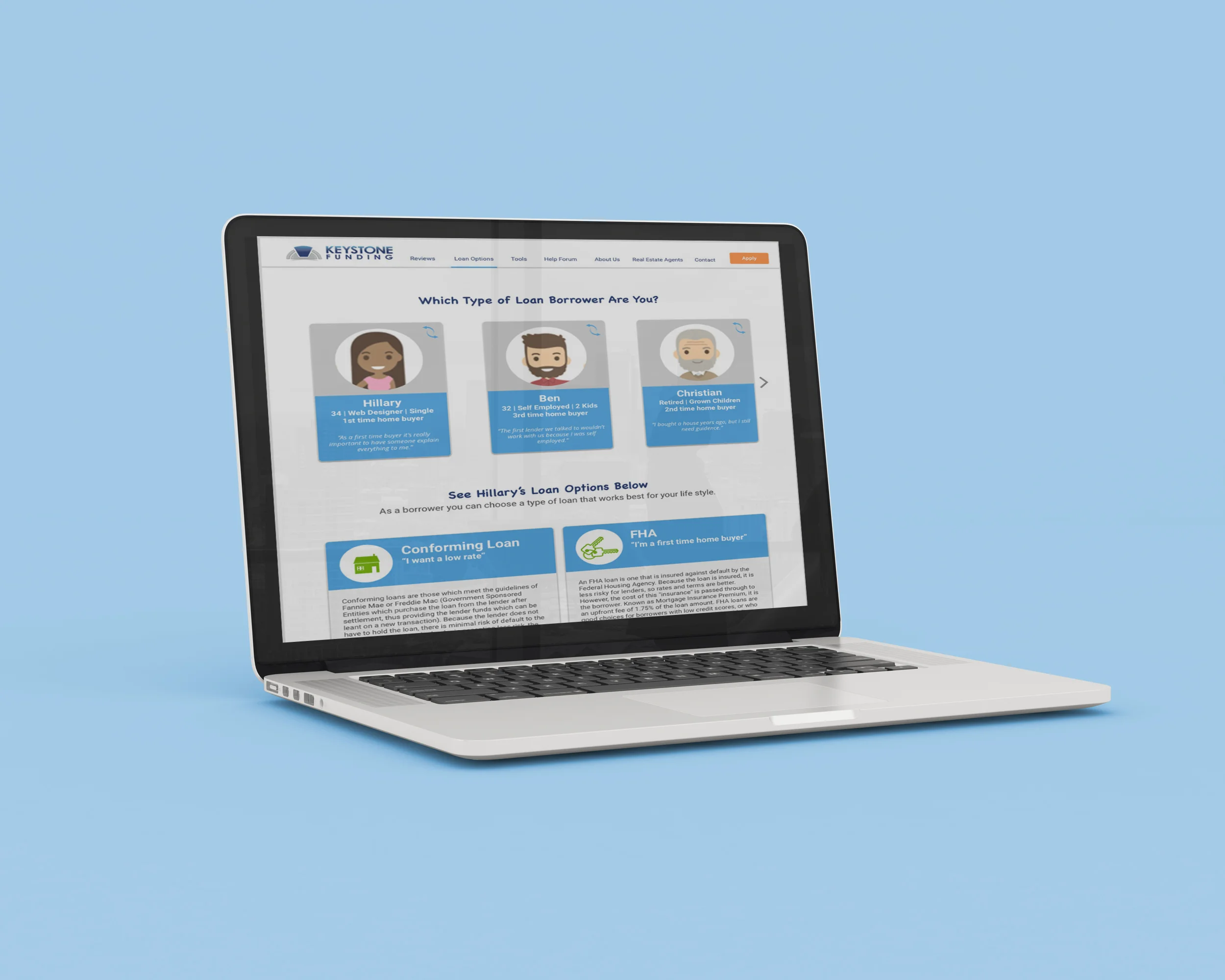
“The most important aspect of their web presence isn’t what I could do on their site, but more learning about and trusting their company.”
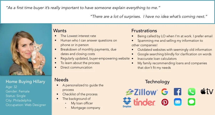
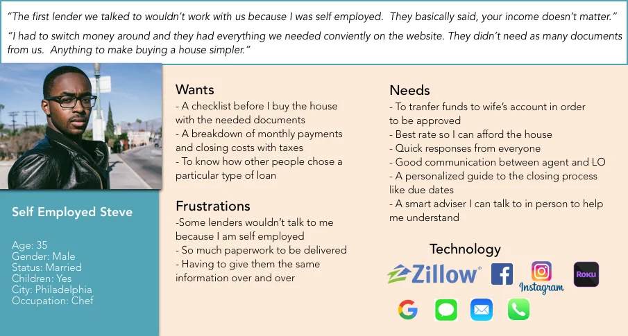
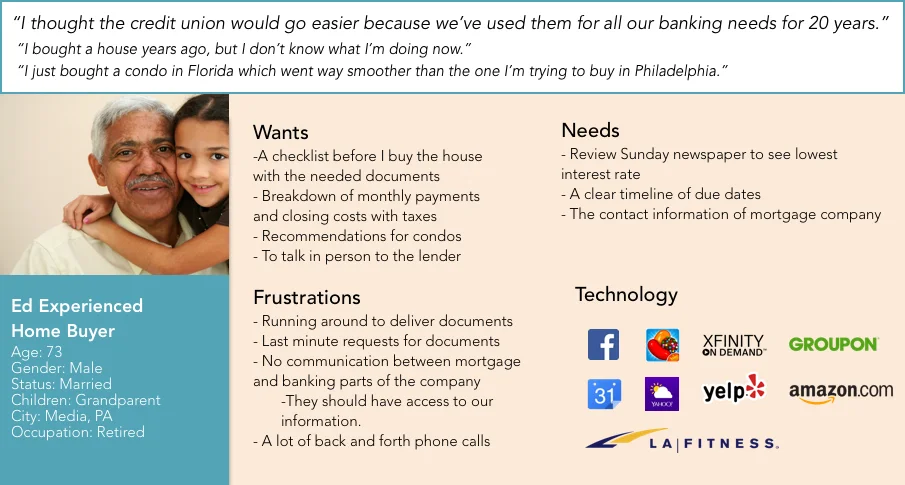
“As a first time buyer, it’s really important to have a person explain everything to me.”
“The website looked like it was from the 1990s so I didn’t trust it.”
“I wanted to know the background of my loan officer”
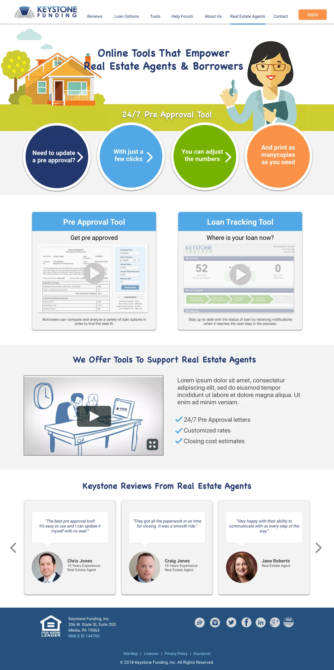
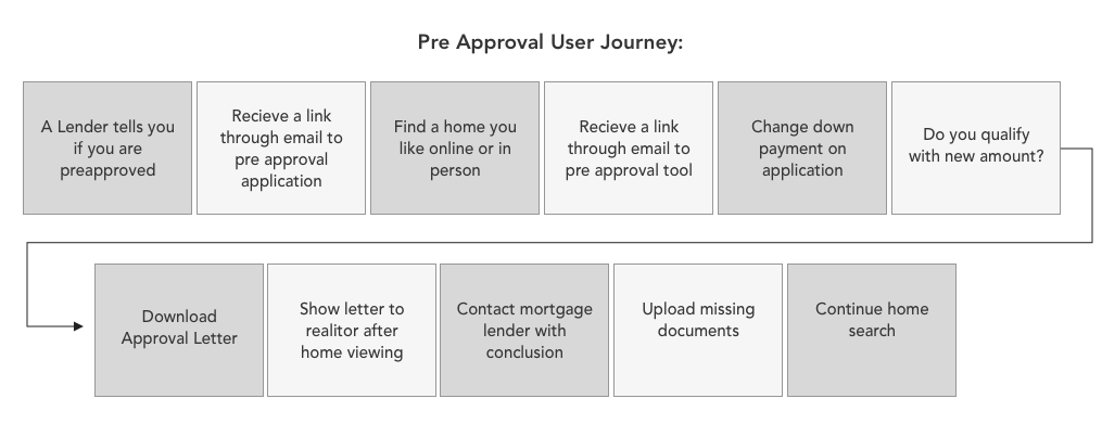
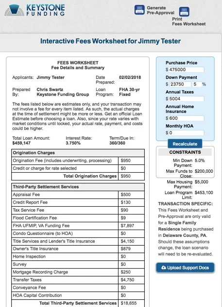
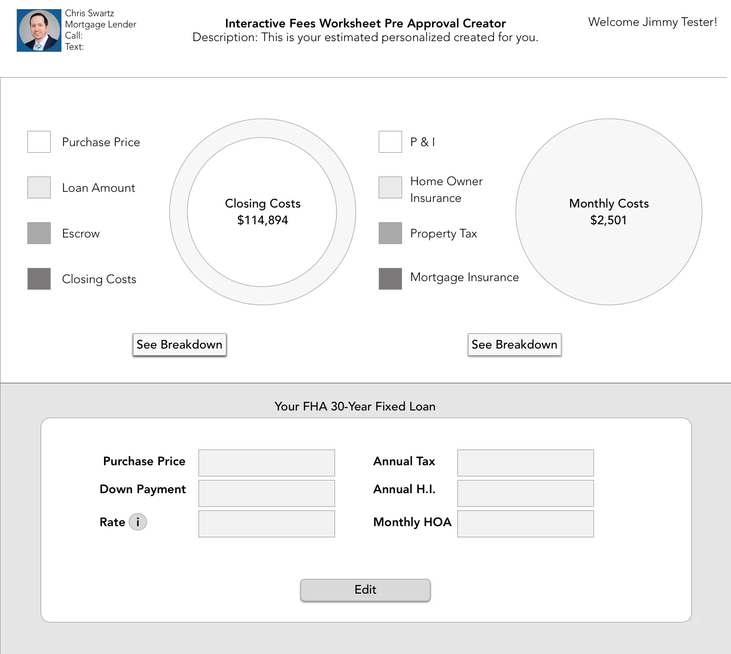
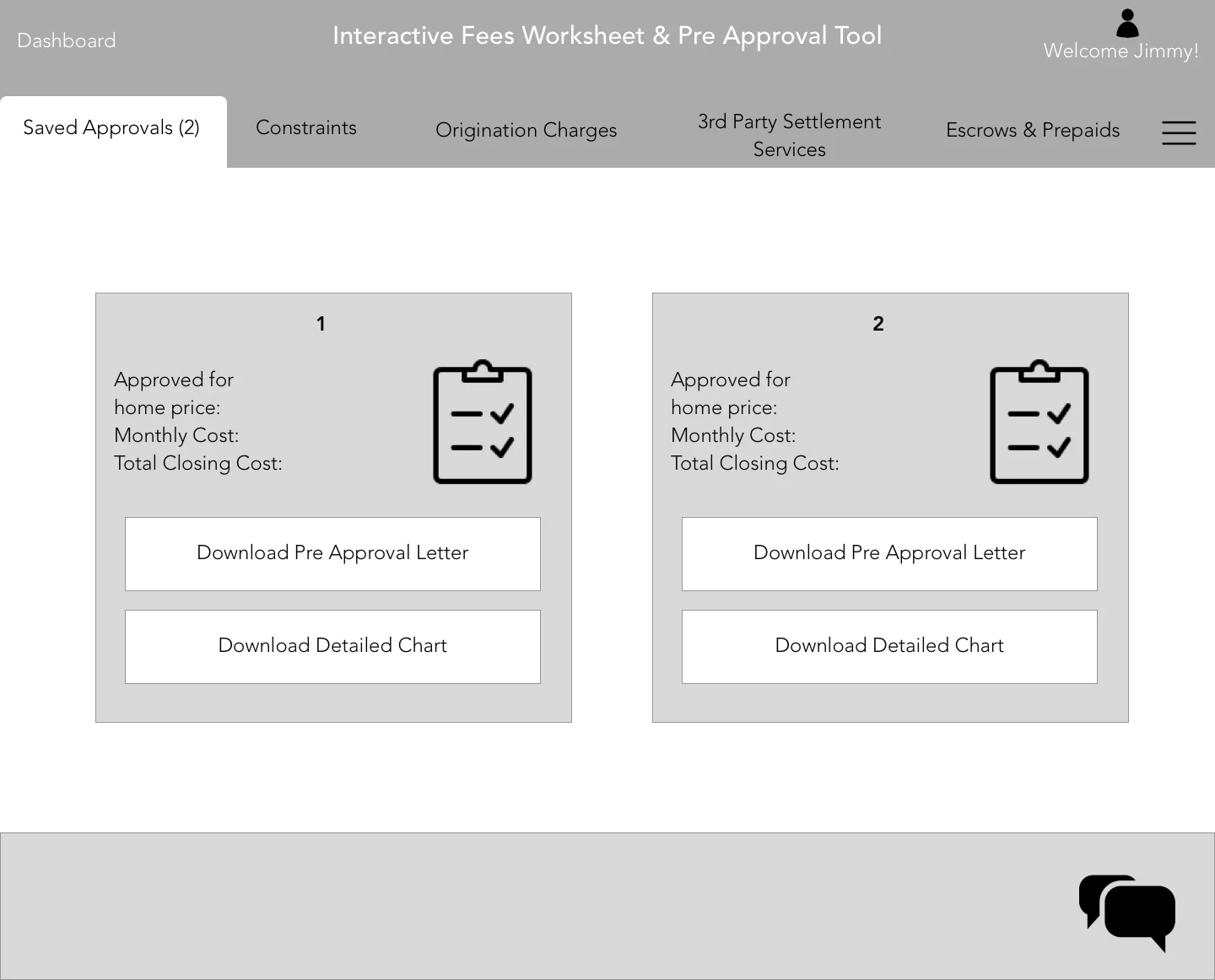
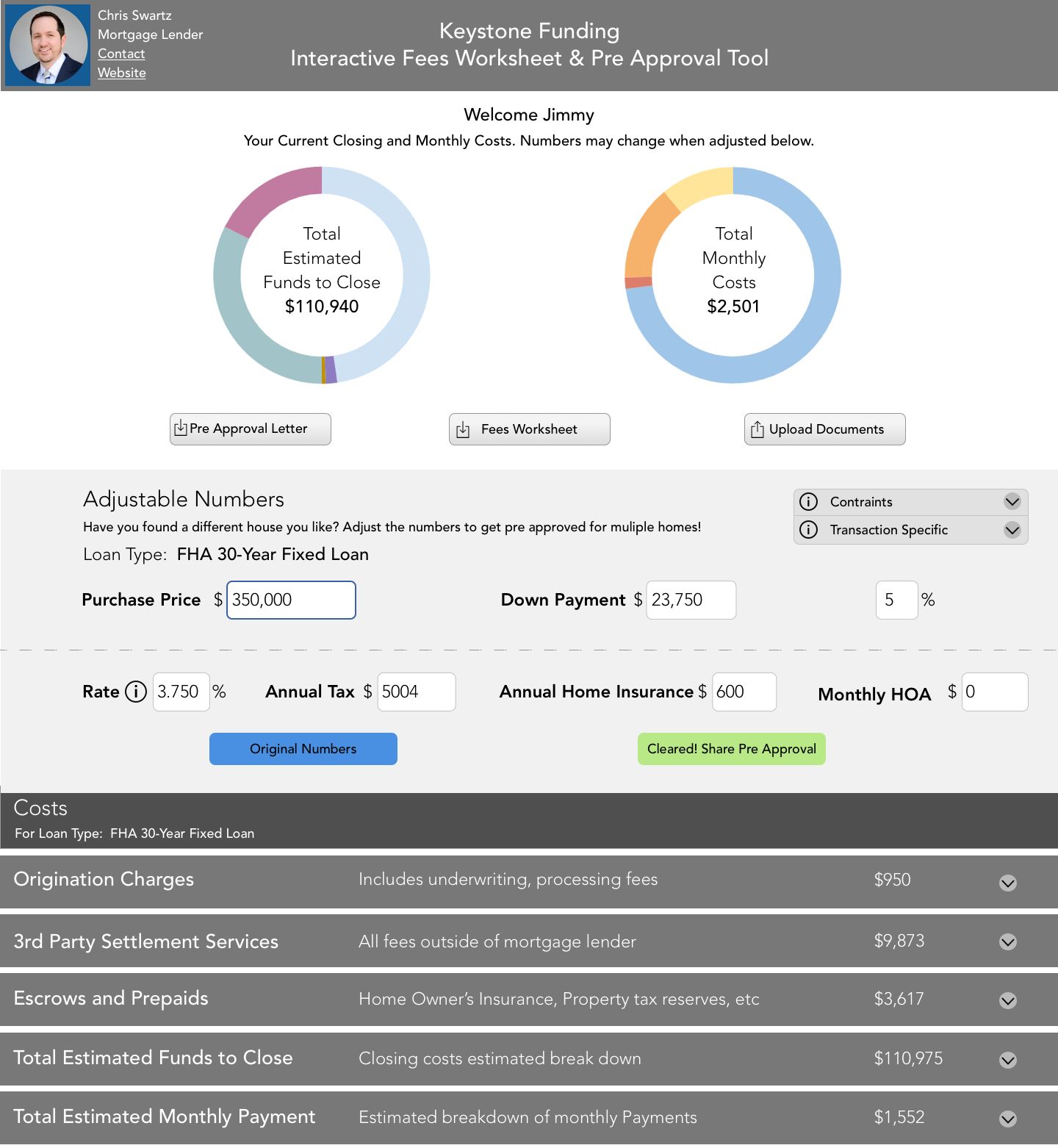
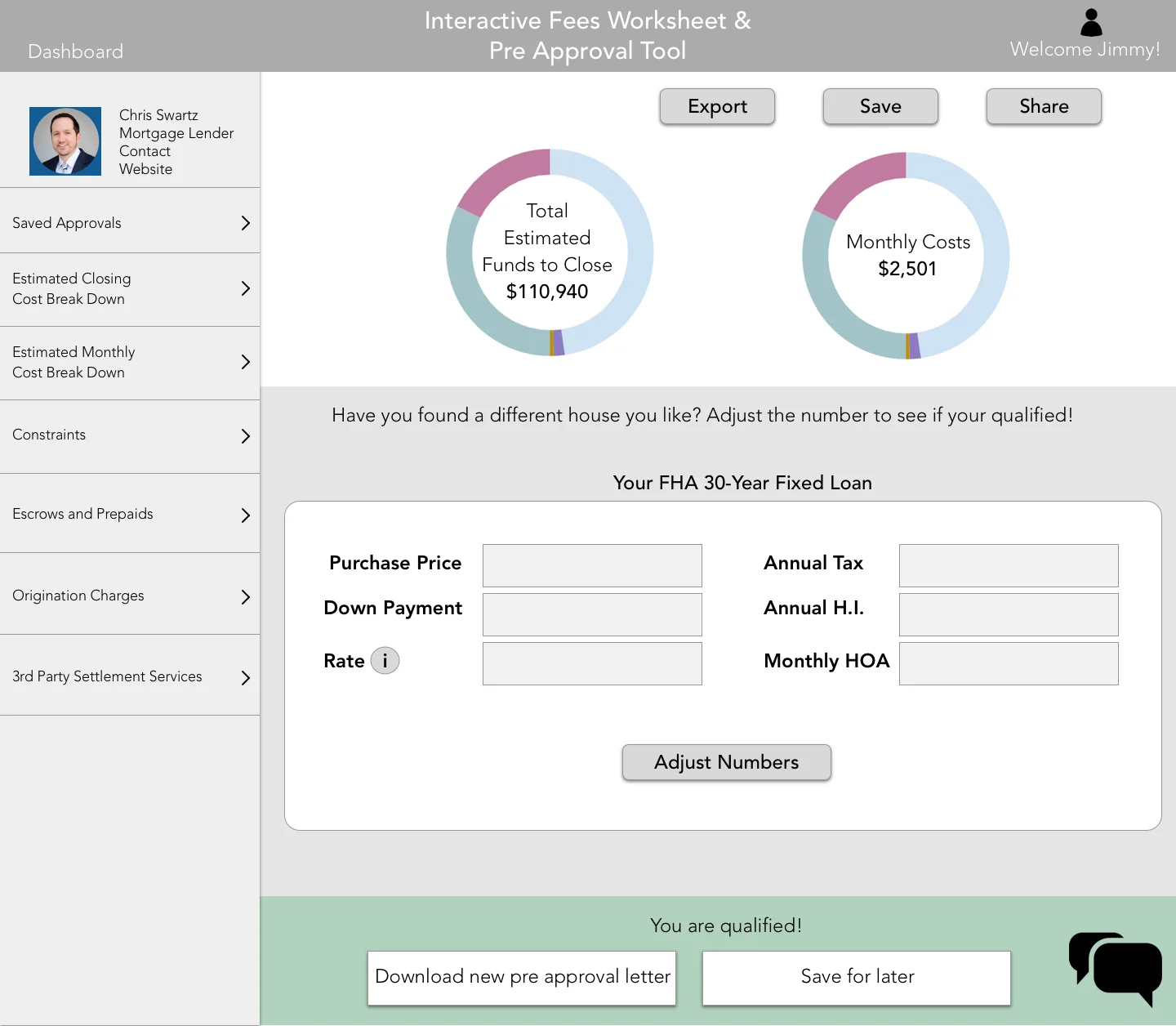
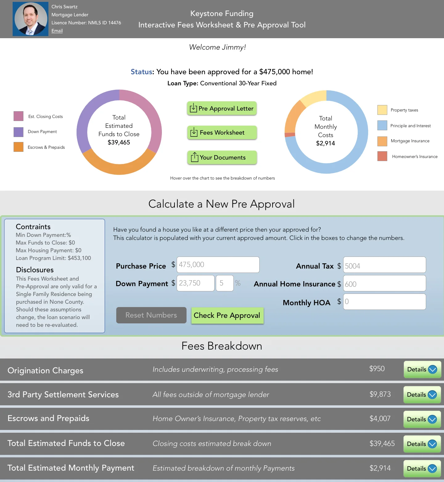
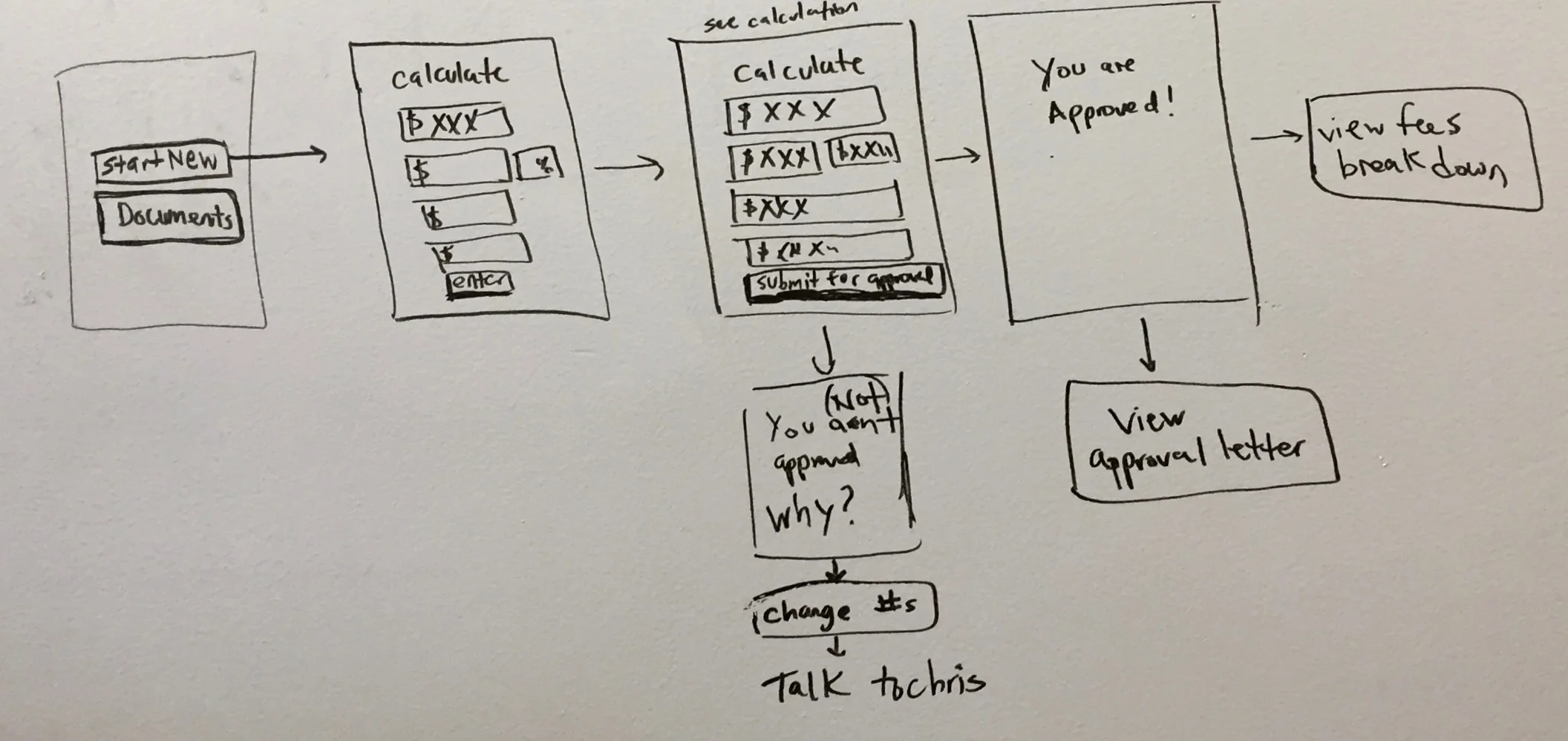
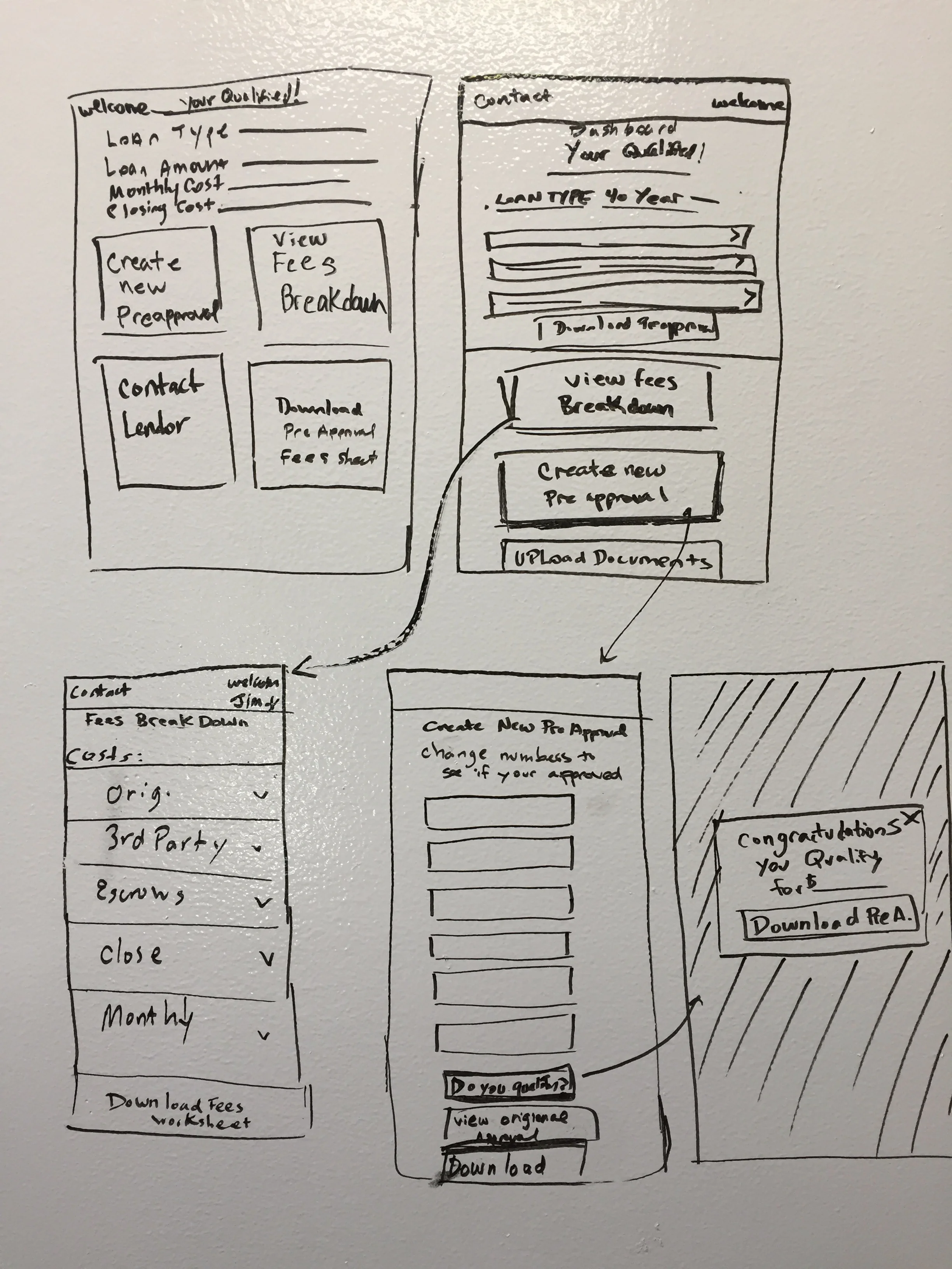
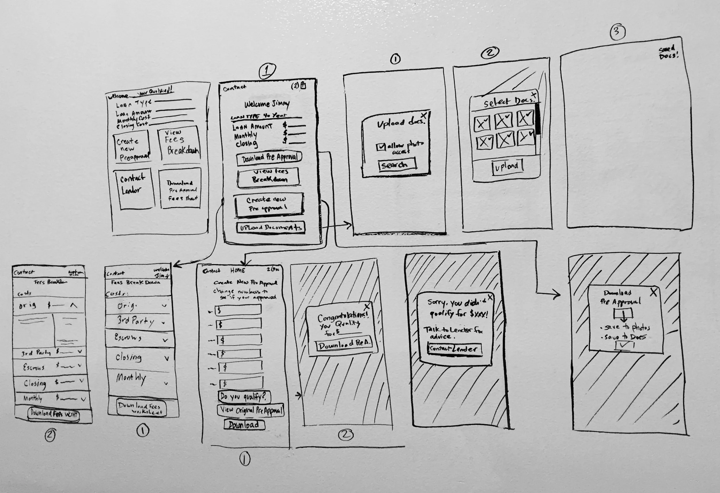
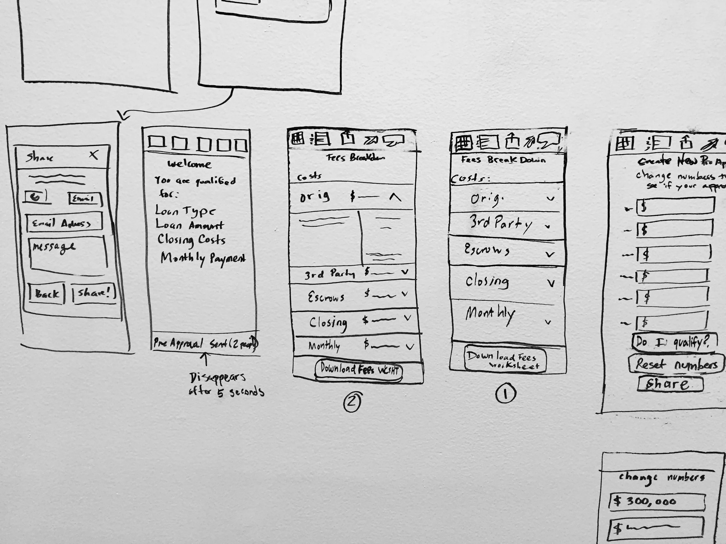
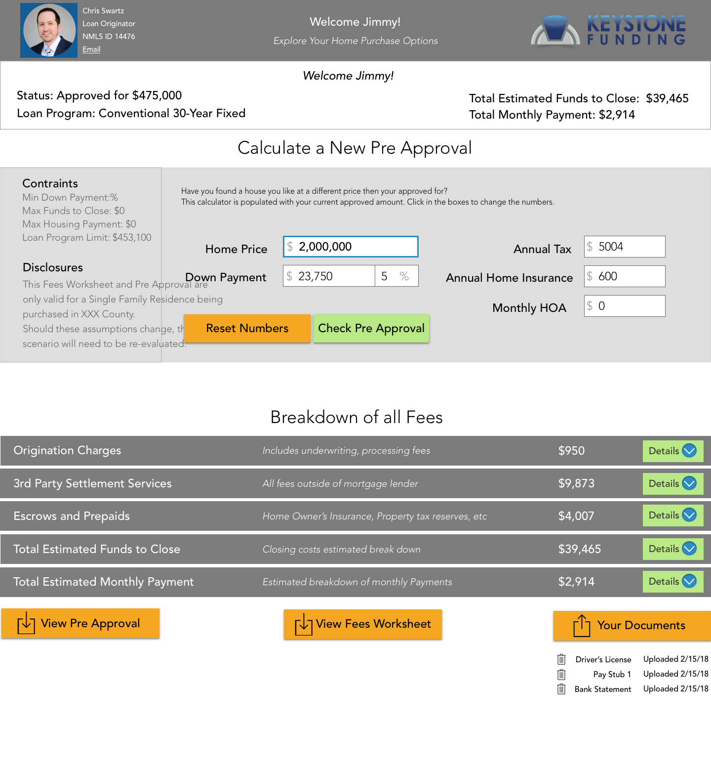
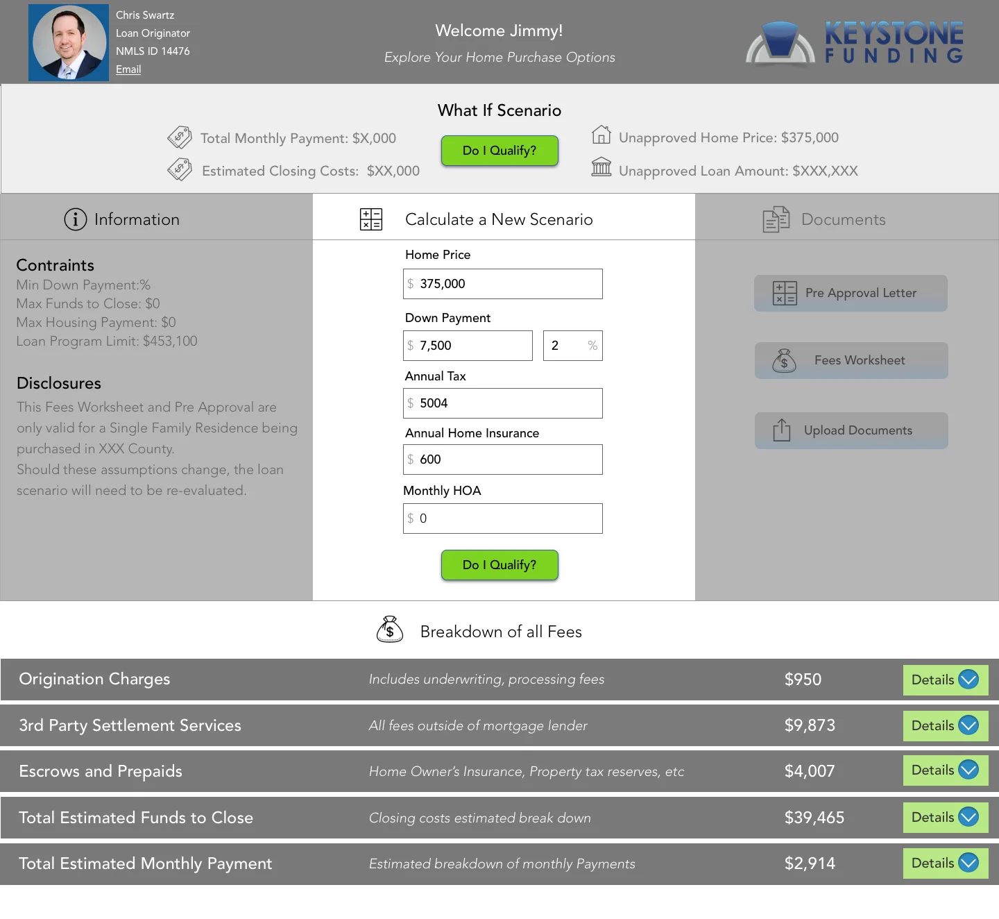
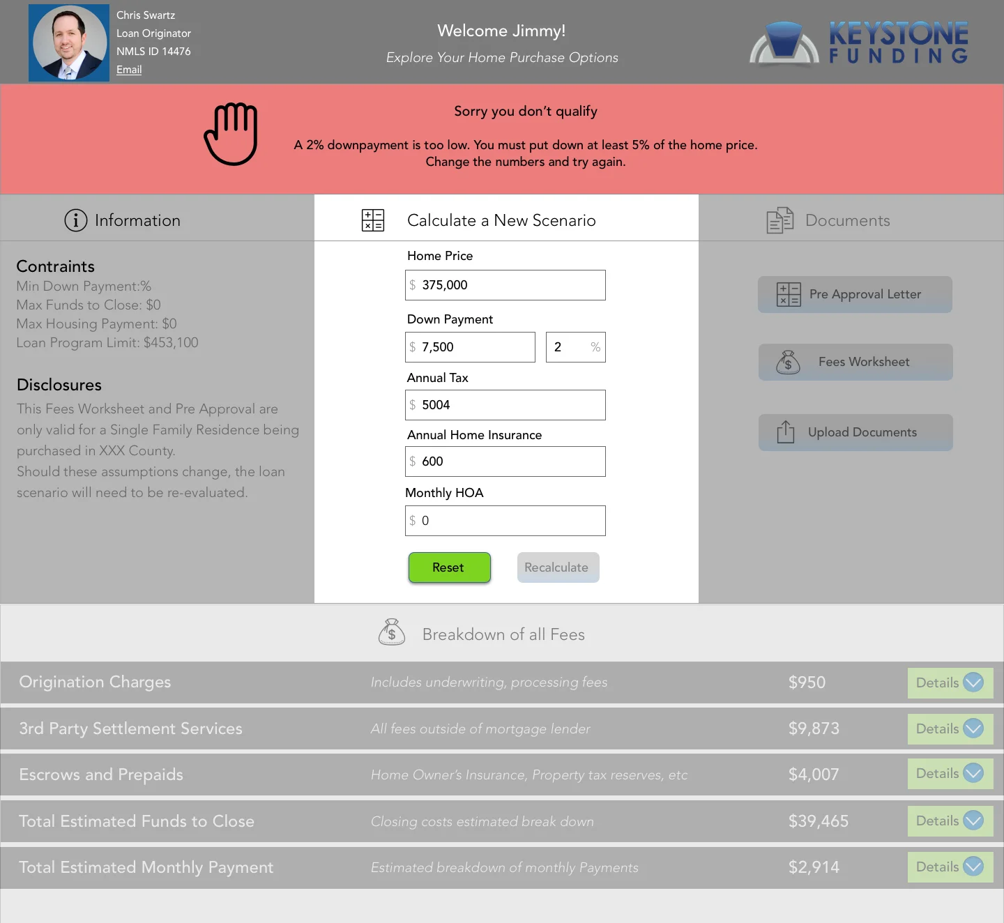
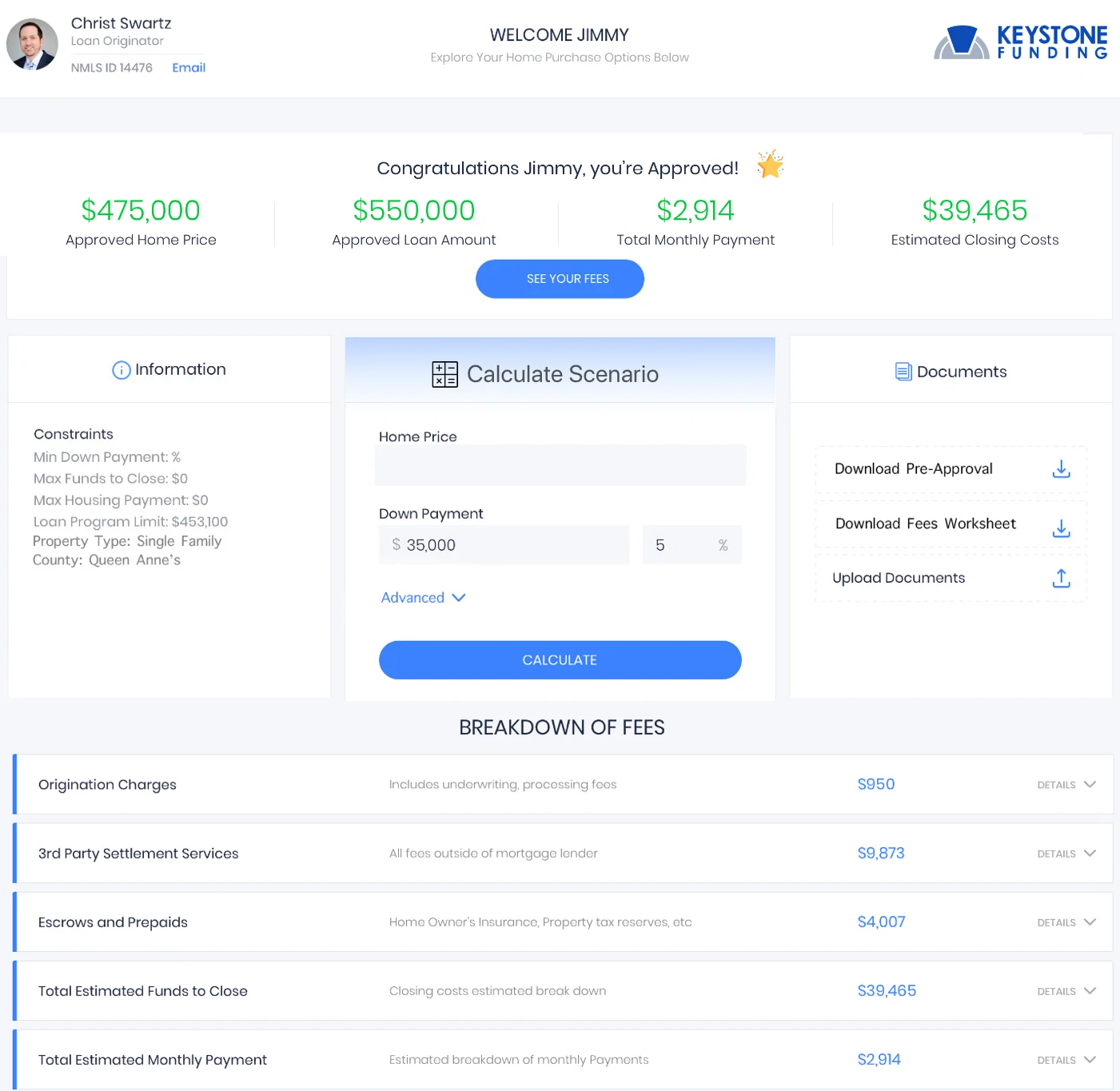
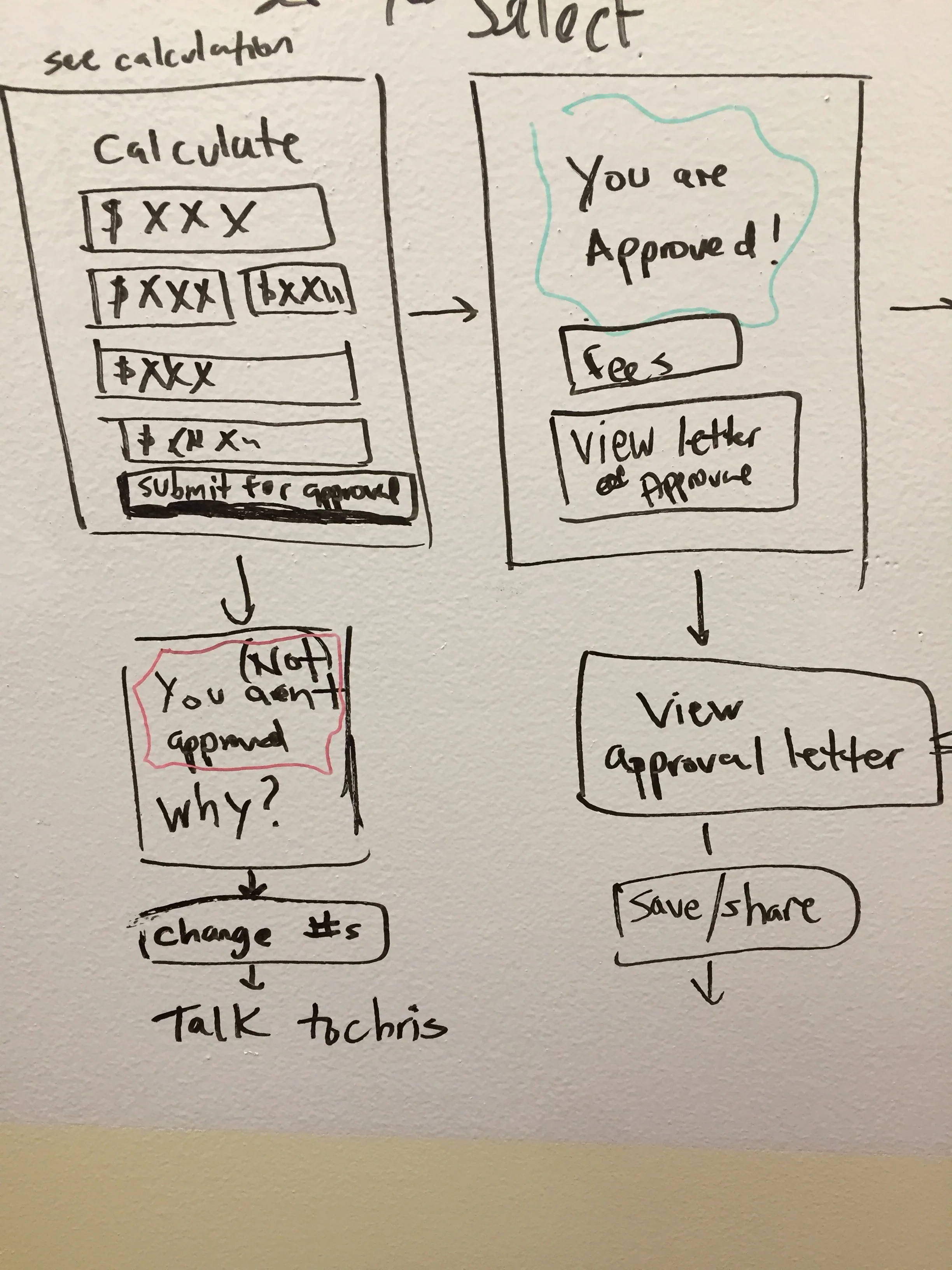
Pre Approval Tool Redesign
Problem:
The tool’s purpose was to empower people to create pre-approvals on their own, without the help of a lender. However, the interface was confusing so people kept calling lenders.
Solution:
Changing the information architecture, I redesigned the experience using familiar colors and buttons to guide the user intuitively through the steps of this complex calculating tool.
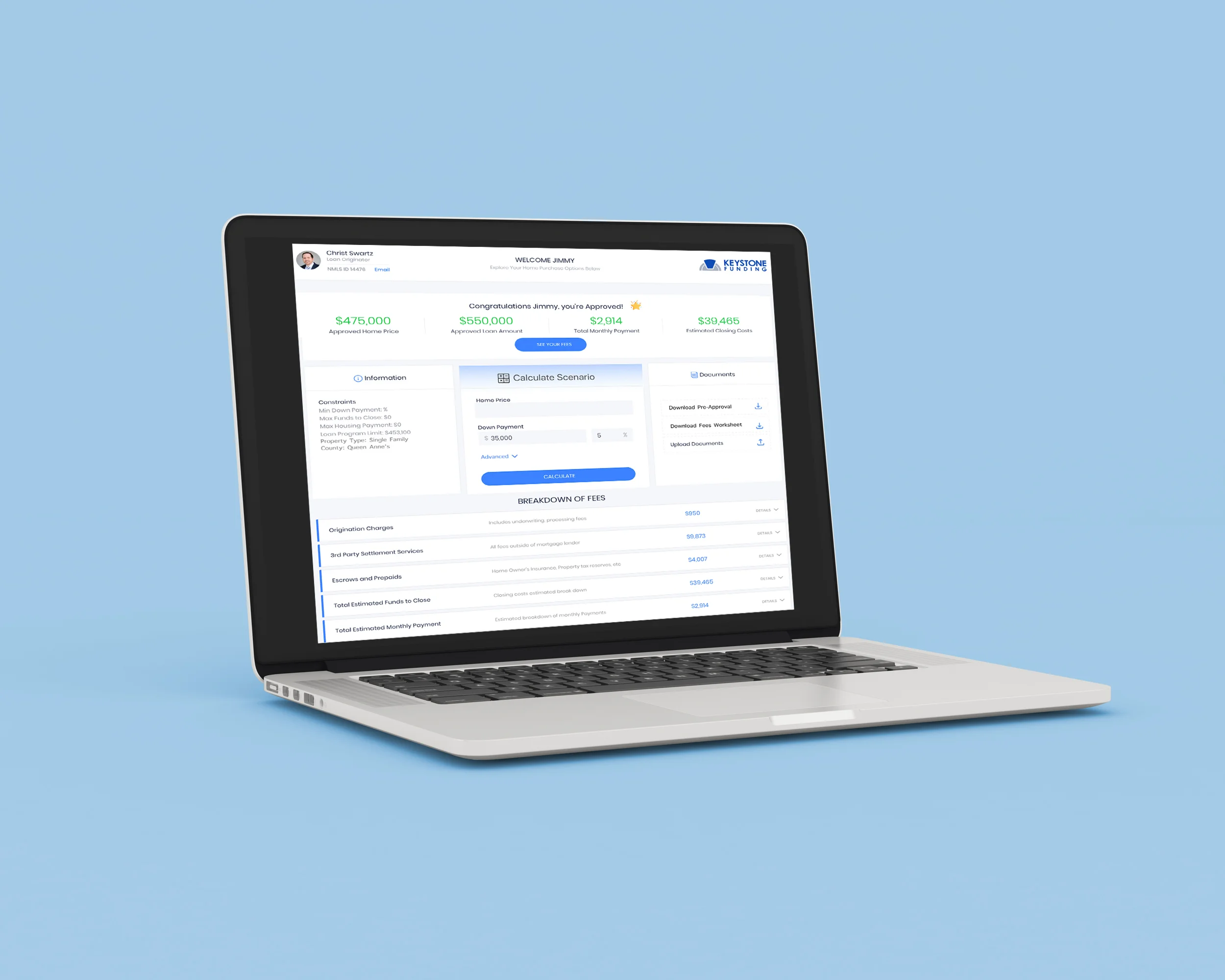
Final High Fidelity Desktop Design
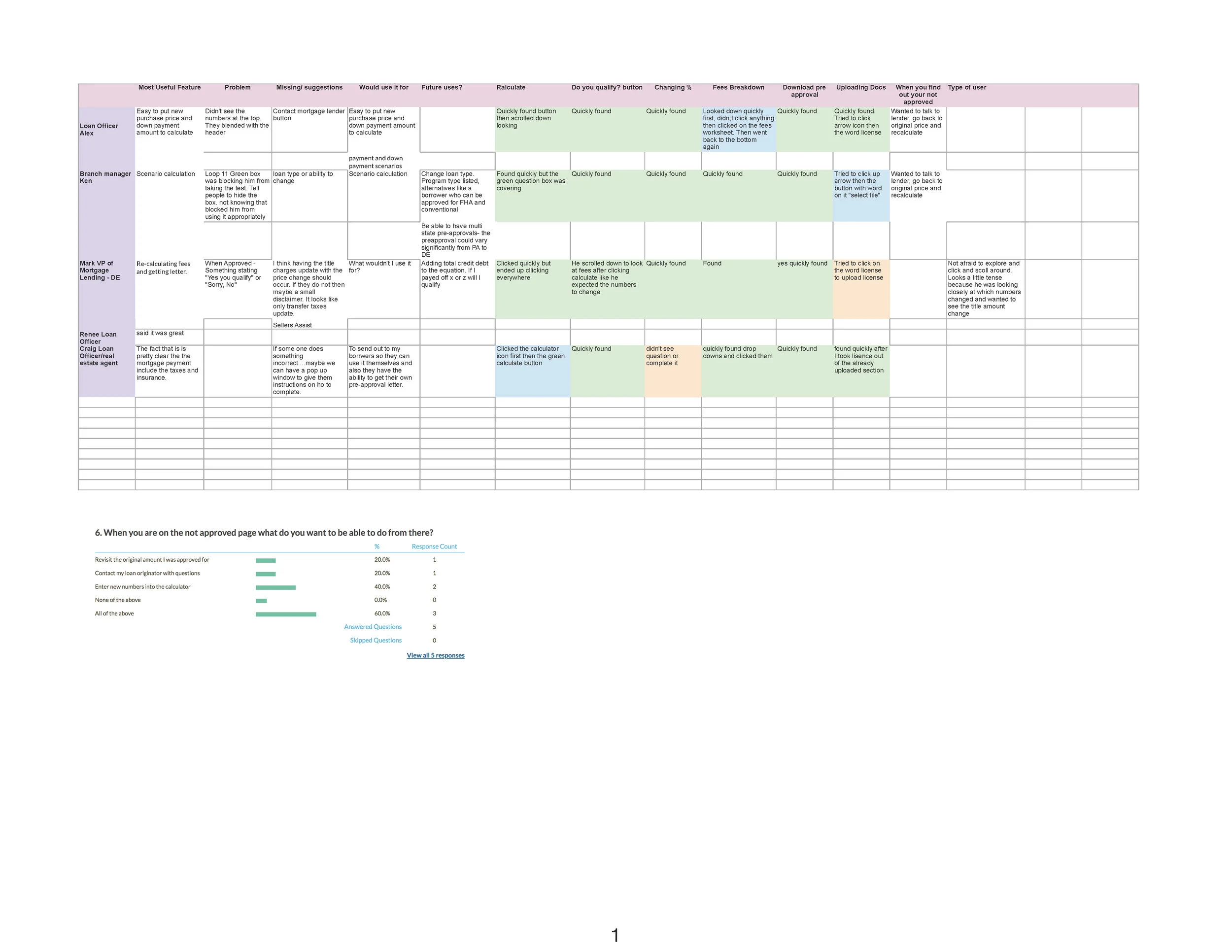
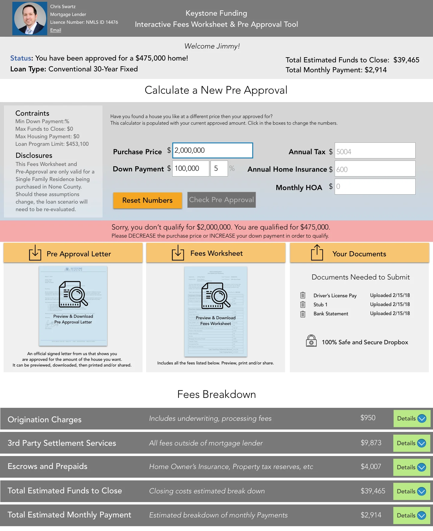
“I blame myself for borrowers not using the pre-approval tool. I need to make them use it. I’m not tech savvy so I don’t feel comfortable using it.
”
“I like to keep it simple. People freak out over the details. The tool is too confusing for them.”
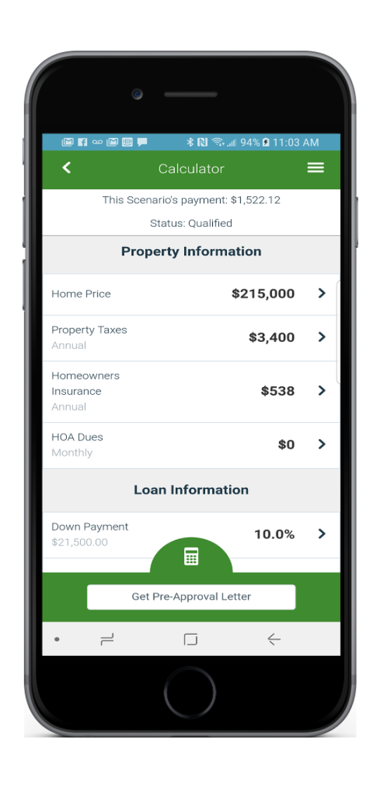
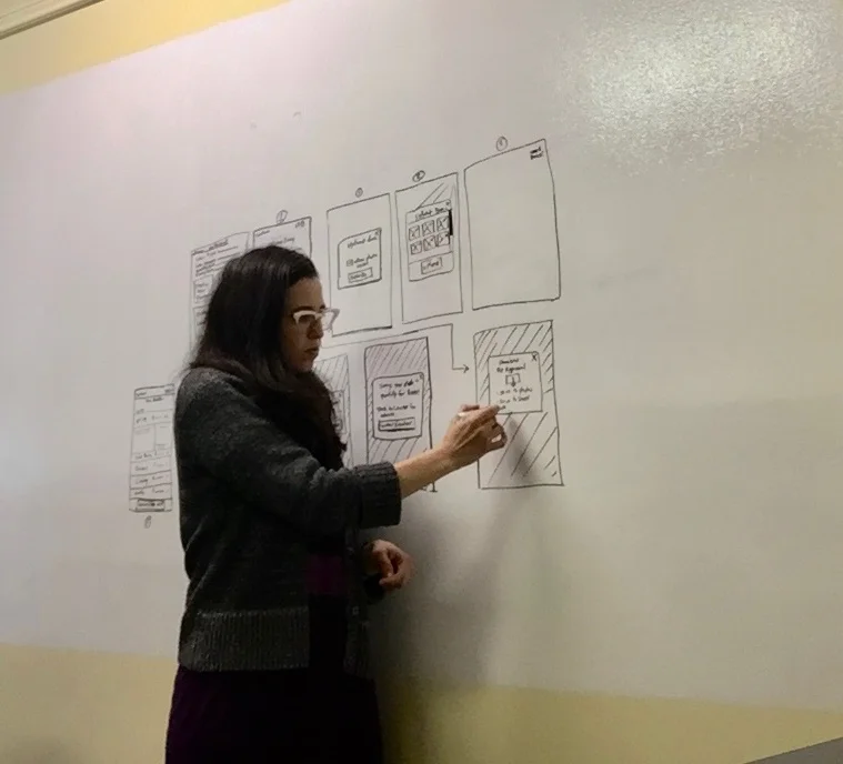
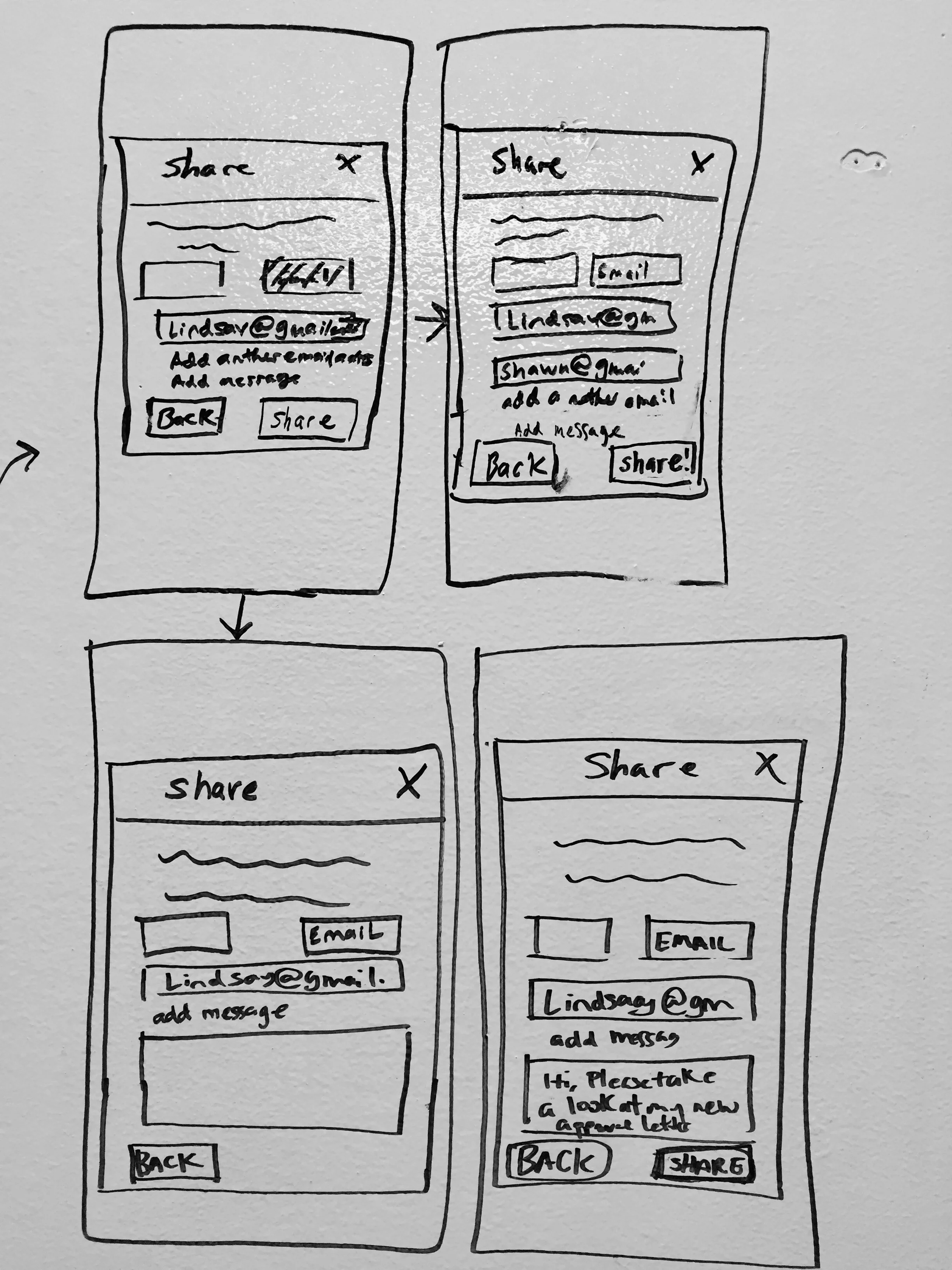
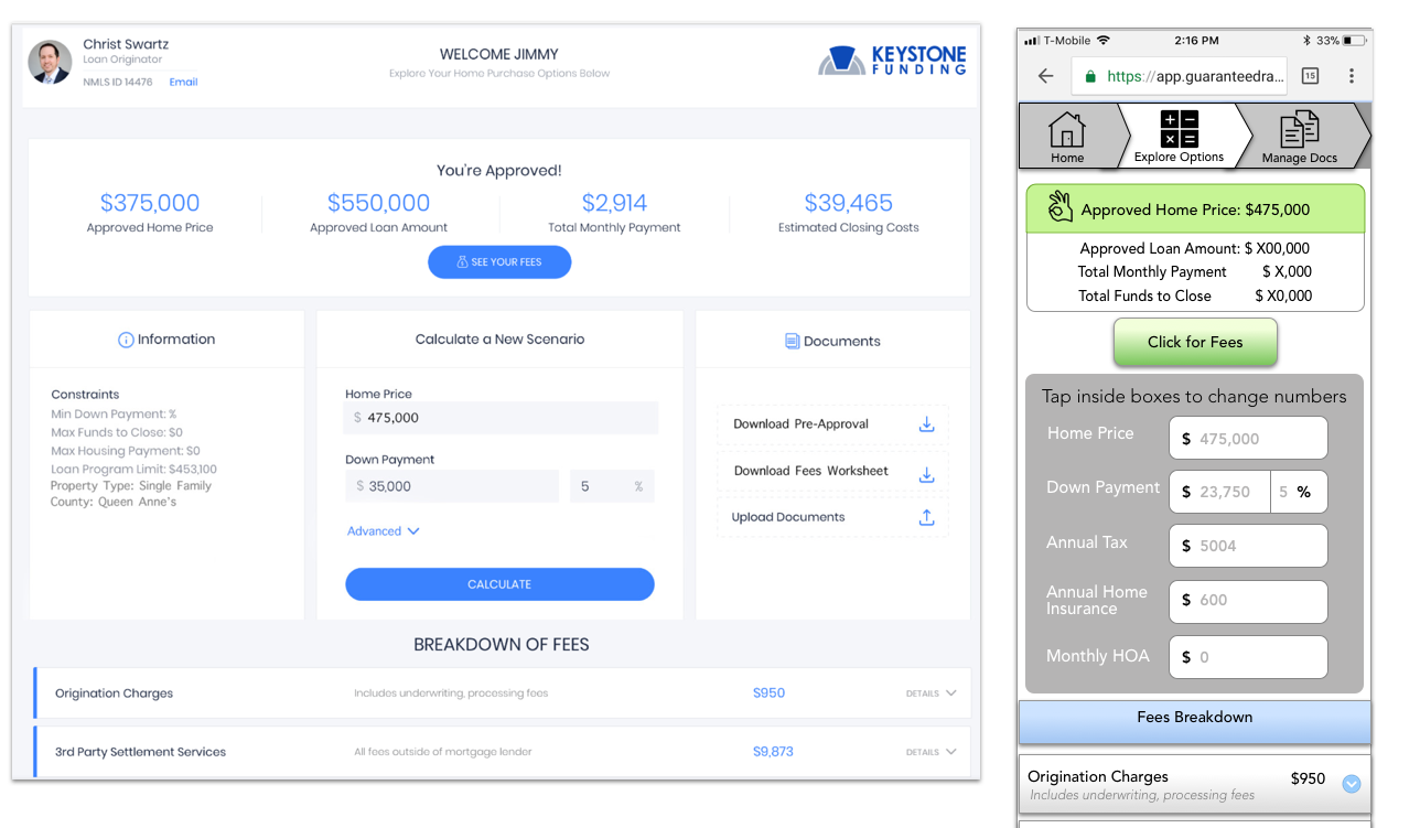
Pre Approval Mobile Prototype
Loan Tracker Tool
Problem
The current tool was only for desktop which was limited as the tool was used while people where looking at homes.
Solution:
Transferring the horizontal design of the desktop tool into a vertical mobile design.
Simplifying the text for mobile version
Adding icons for accessibility and understanding
Keeping consistent branding and business regulations
Loan Tracker Prototype
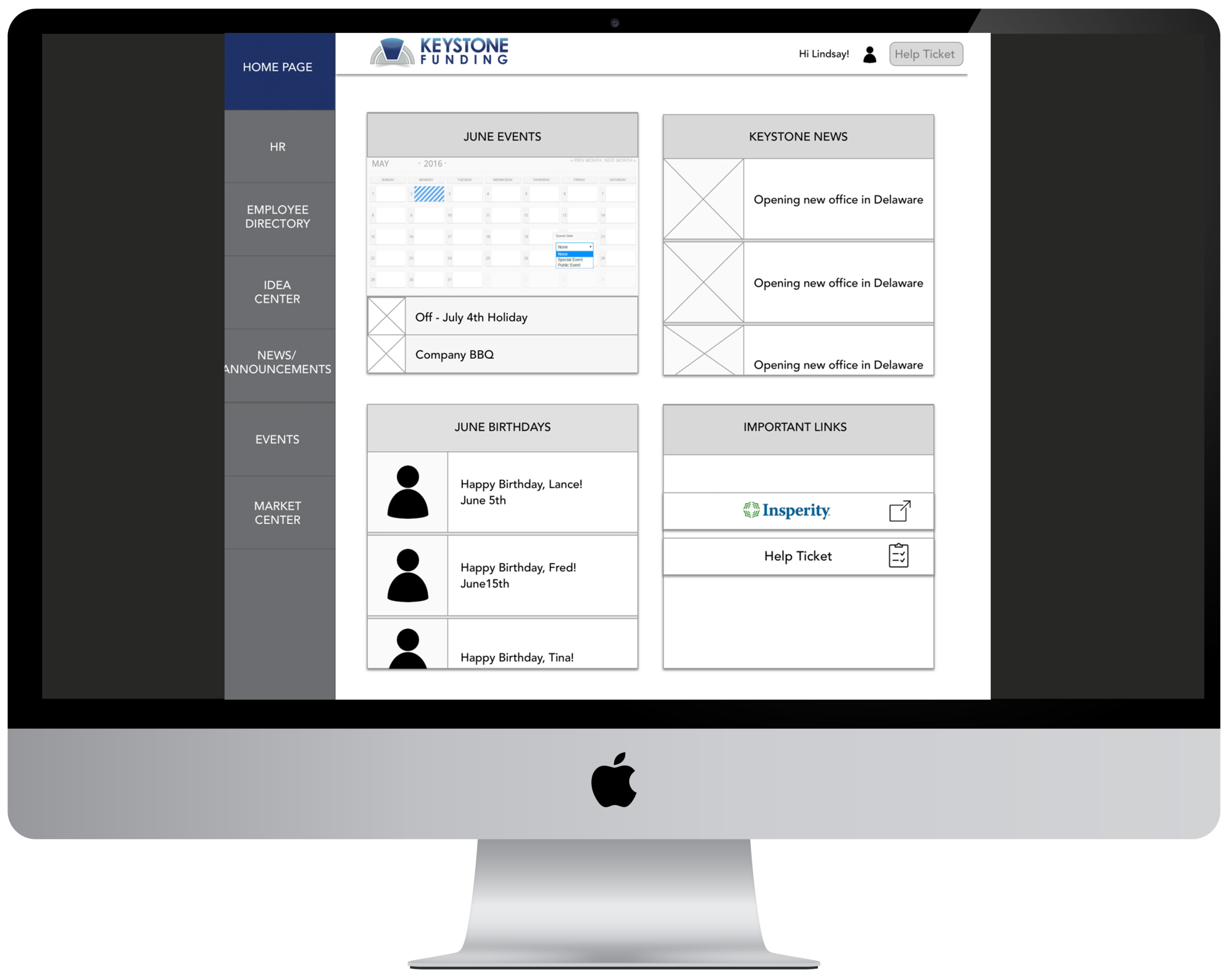
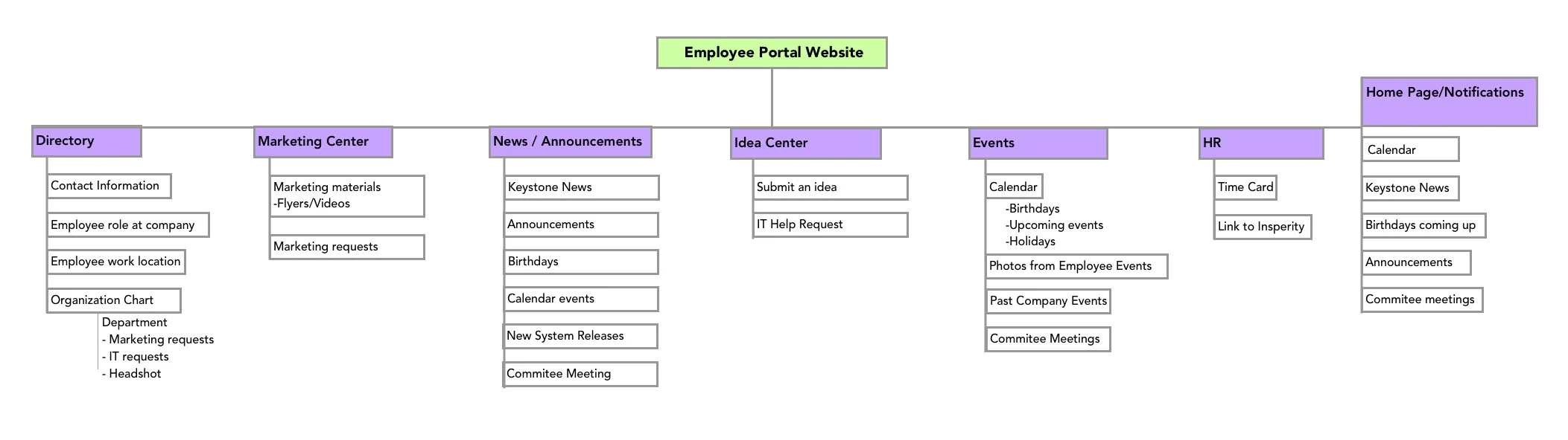
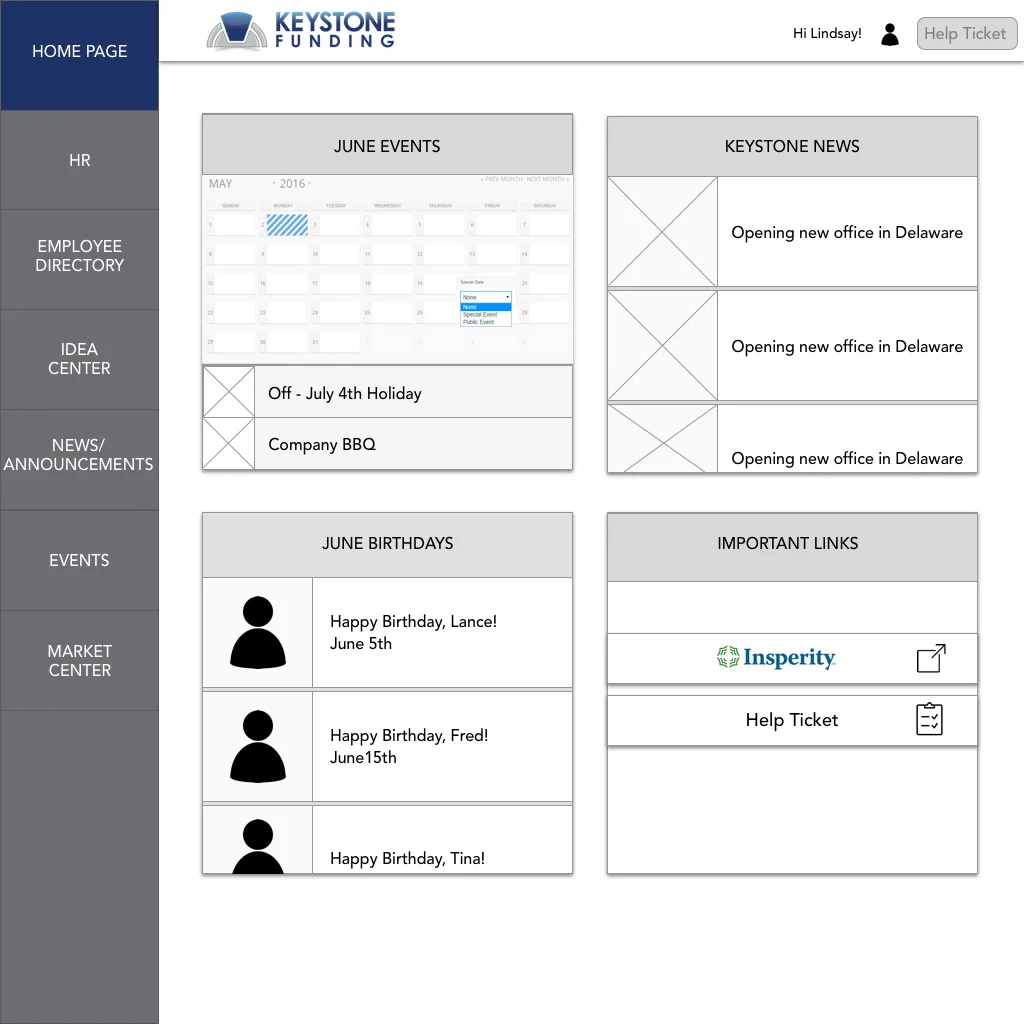
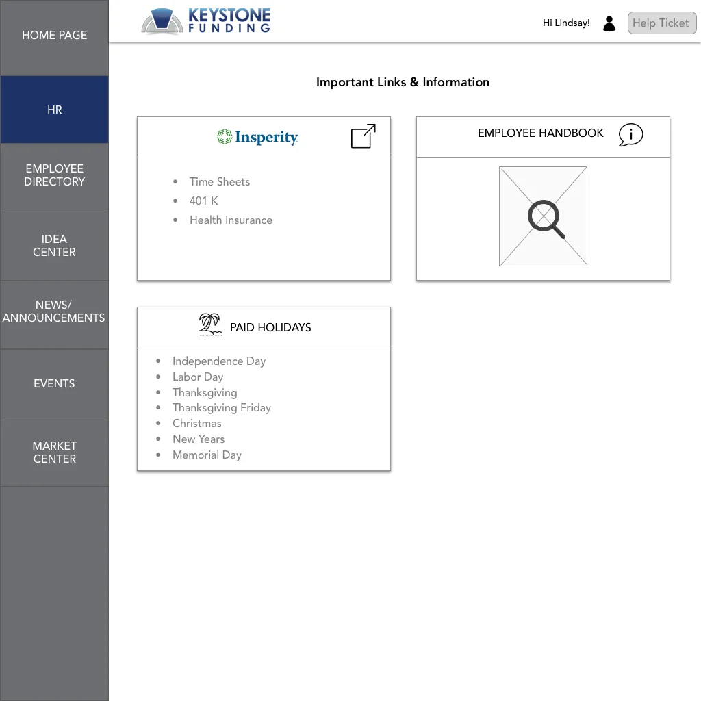
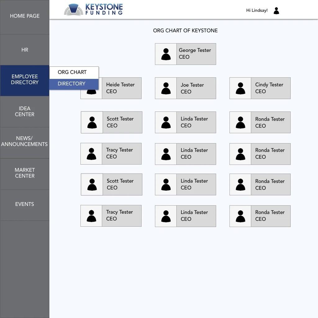
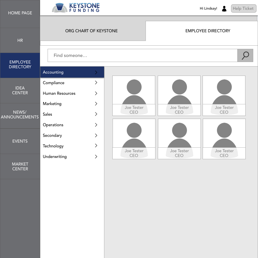
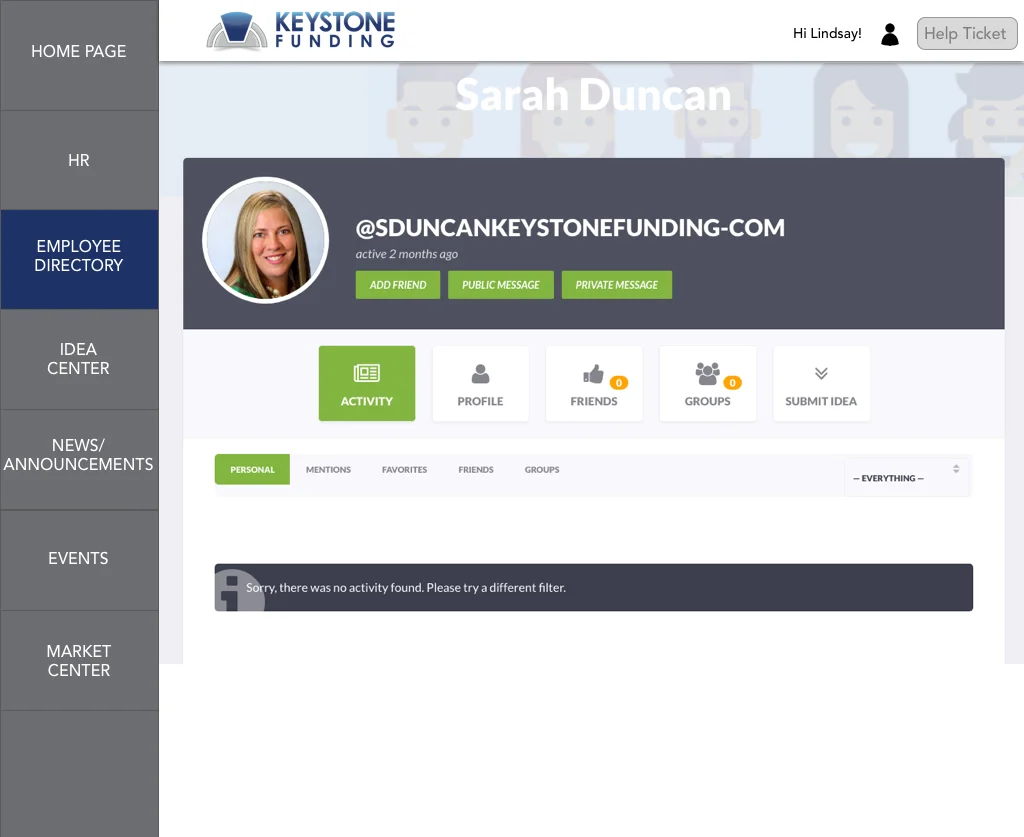
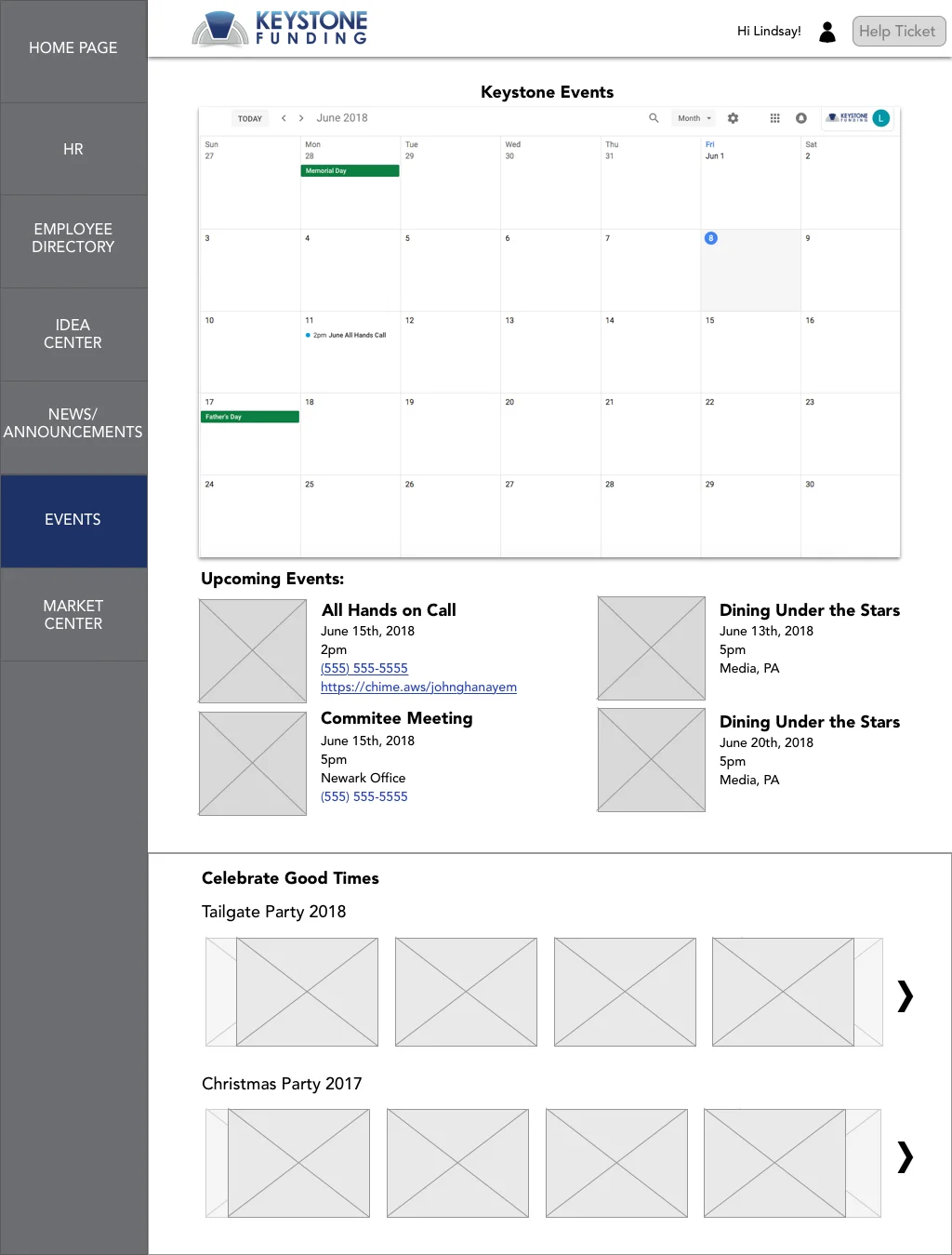
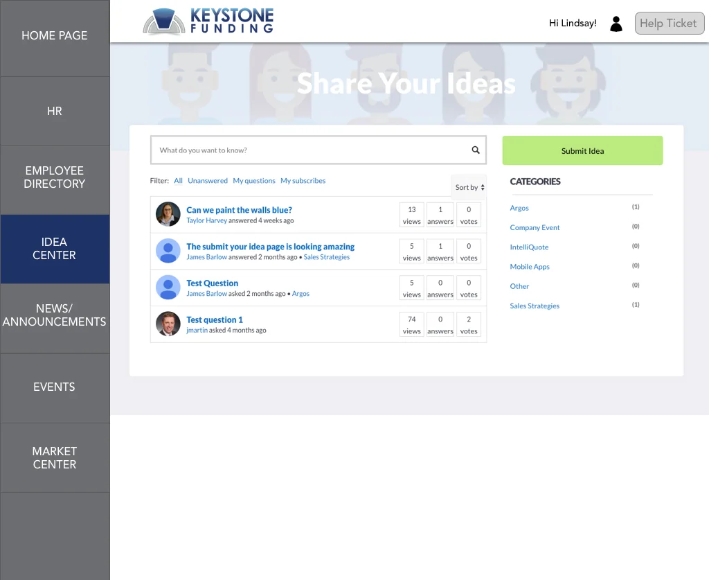
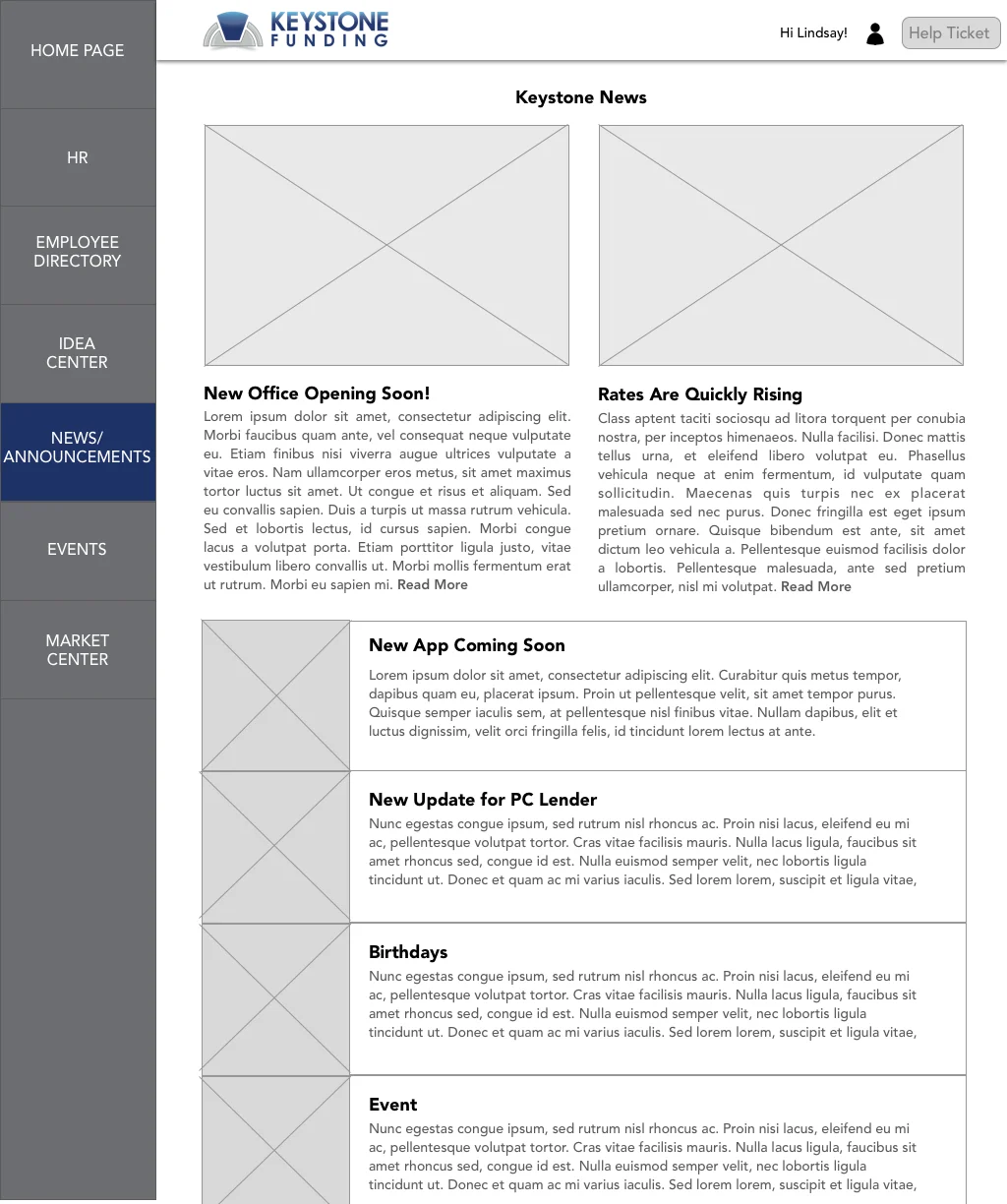
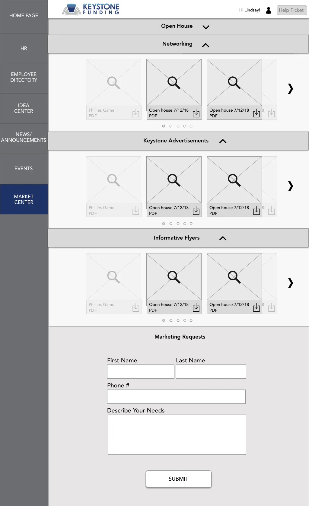
Intranet Site B2B
Problem:
Employees from different offices across multiple states need a way to connect and stay up to date on company wide news.
Solution:
Learning which information was most relevant, as well as industry news, employee birthdays, help links and upcoming Keystone events, I used Wordpress templates to structure page design.
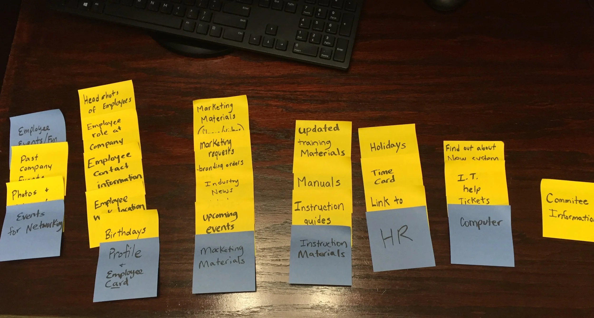
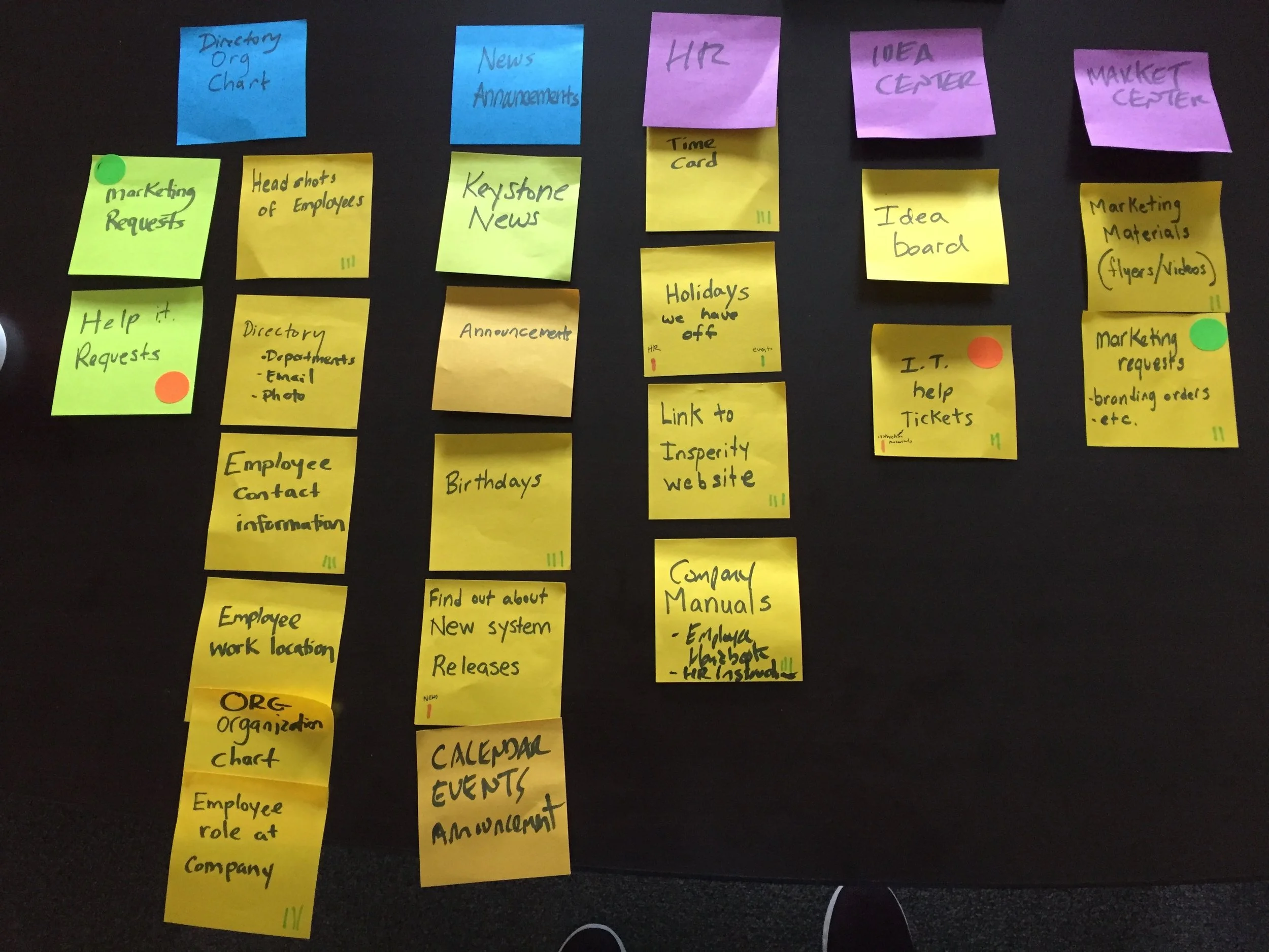
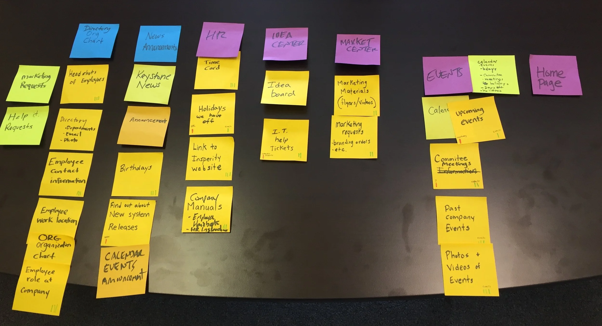
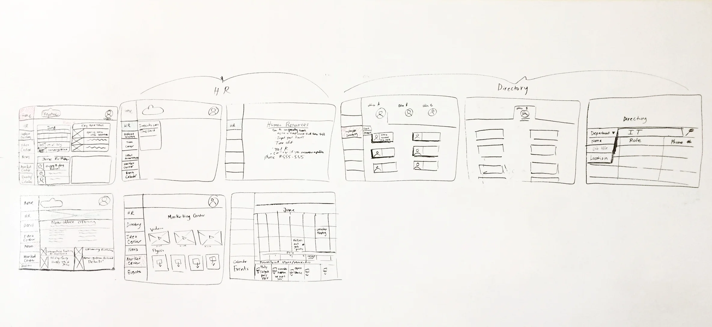
Process:
Card sorted with the CEO and employees at Keystone
Sketching
Wireframes
Prototypes
Usability testing