
Company: Istation
Project: Explore Menu
About: The explore menu was needed as a place for students to access micro lessons . Similar to streaming services it would allow students to have agency to choose what they wanted to work on in class.
Problem:
New content called micro lessons that were more gamified and fun were being created but there was no where for students to access them
Students weren’t able to choose where they wanted to go in Istation.
Most of the content was old and it couldn’t be coded or edited.
Competitive analysis
These are all the companies I looked at for inspiration in design and layout
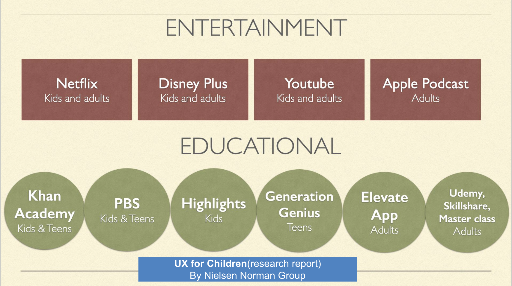
Helpful for us when designing the cards was to know that youtube shows multiple episodes with a stack of cards
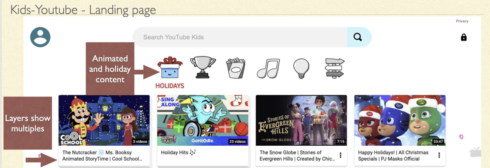
Designing for younger children but the Icons work for children of all ages

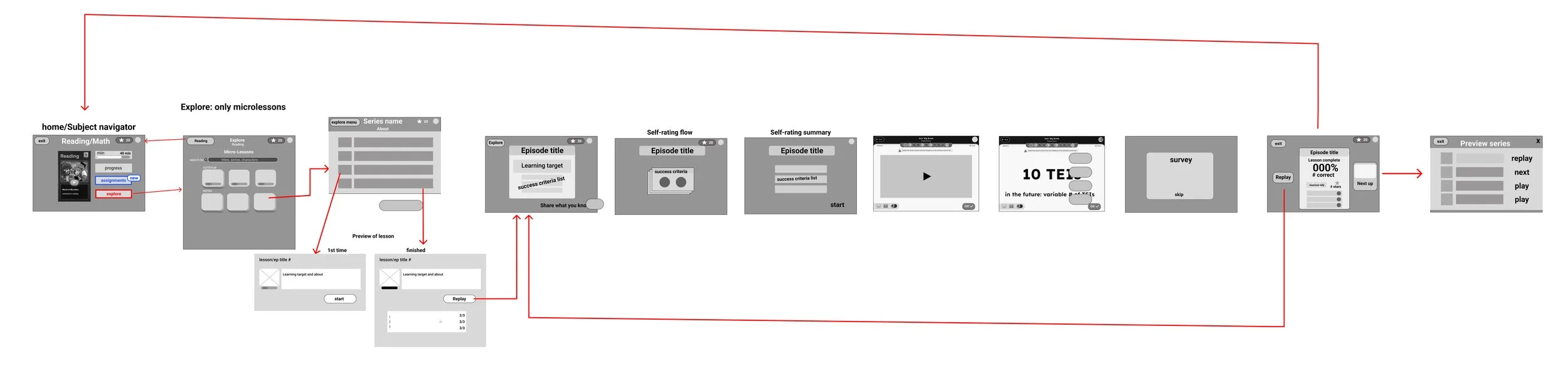
Flow Chart
This shows the flow of how a student would get to the explore menu from the subject navigator page, choosing a series, choosing an episode, seeing the preview screen, starting the lesson, going through the lesson, and ending at the series page again.
Sketching
For a awhile we weren’t sure what content would be in this menu. These are some of the sections that may have been in there. Many didn;t make it because non of the content was able to be accessed from the original site and there wasn’t a database for all the content for the engineers to pull from.
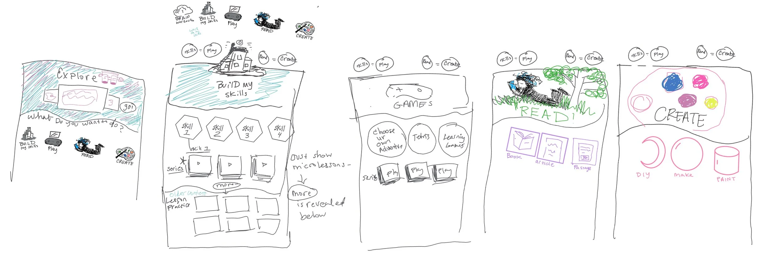
Explore menu potential sections: Build skills, play, read, create.
Low Fidelity Wireframes:
During wire framing, designers, developers, and stakeholders communicated clearly with questions and answers. The menu was initially designed for various content types but for the MVP it contains only micro lessons. These motivational designs show learning challenges and recommend content based on monthly holidays, with shapes filling up as skills are finished.
Potential motivational features:
Other students' top picks
Activities aligned with your searches
Tasks you've rated highly
Grade-specific suggestions
Challenging exercises
Past favorites' alternatives
Holiday-themed options
Skill completion status
Newly designed microlessons


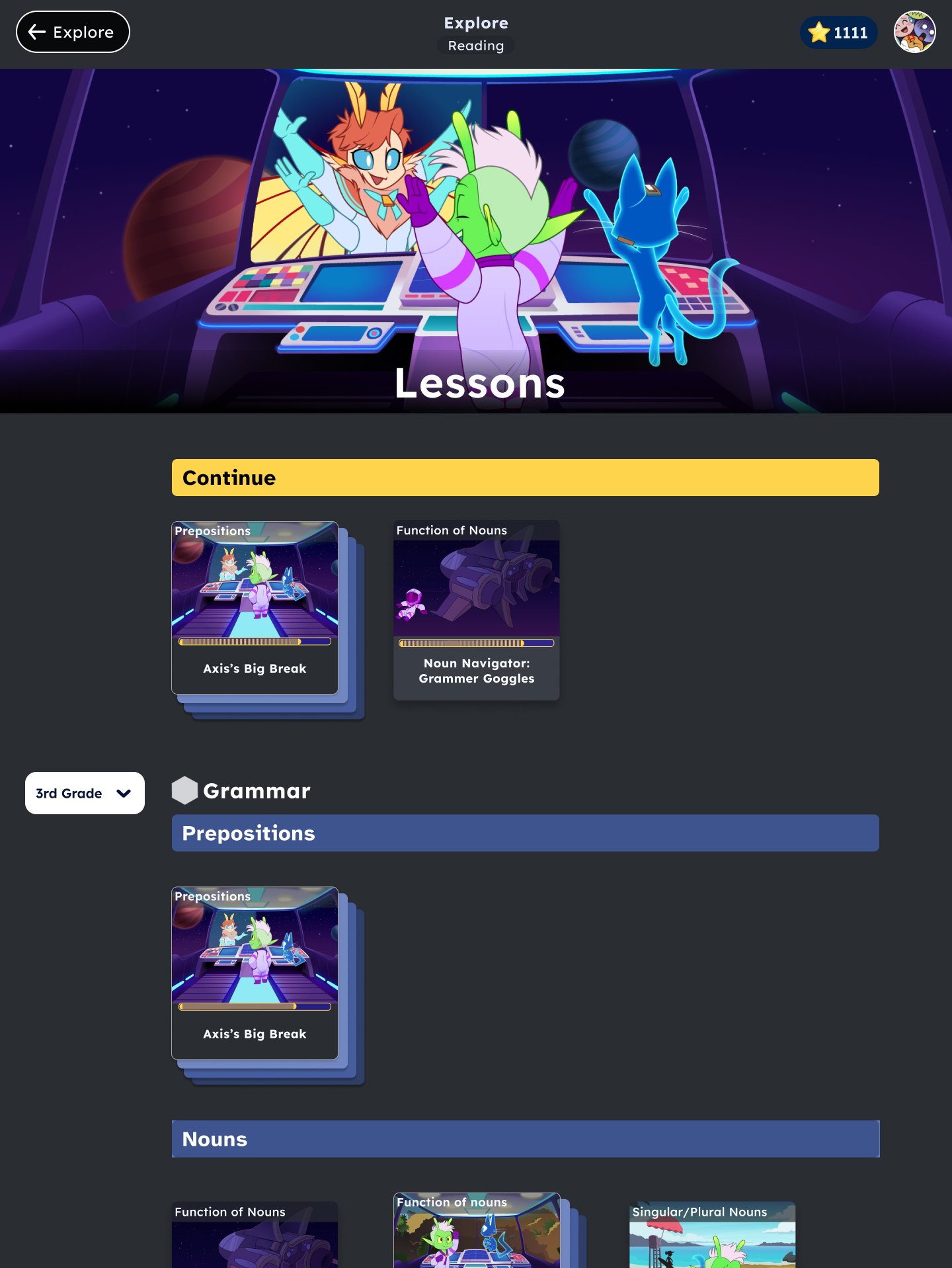
MVP - Just micro lessons so the design became more focused with less need to filter
Information Architecture
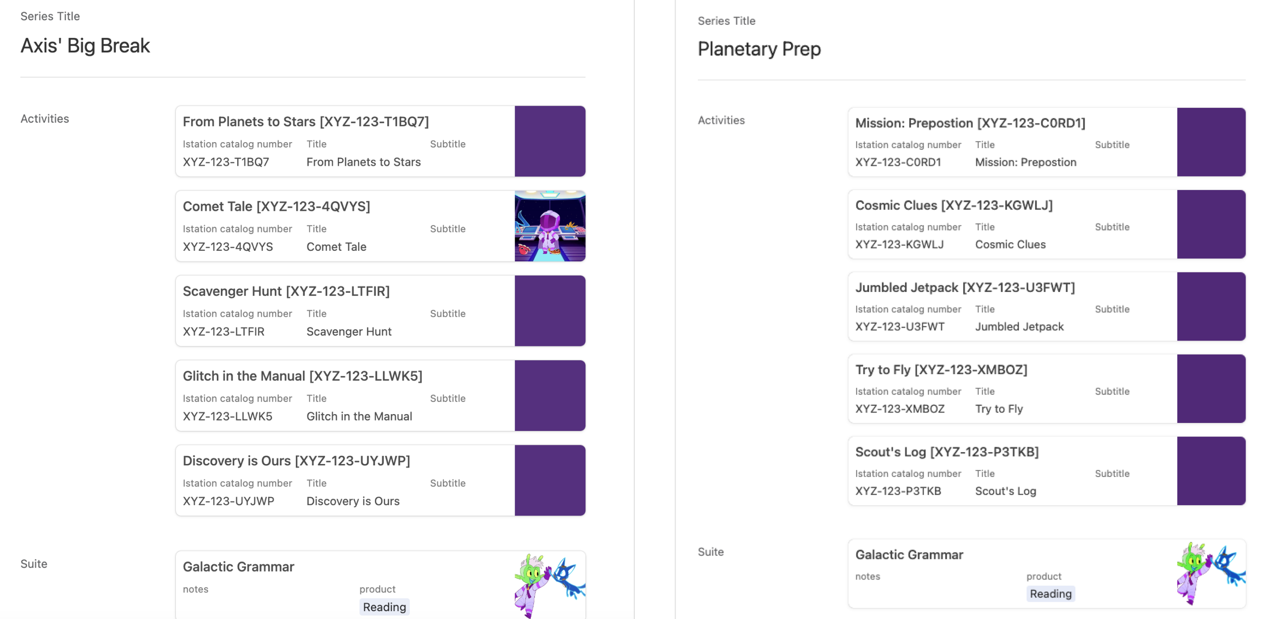
Worked with product managers to acquire the series information
In order for UX design to be completed there was a need for organization of content. Curriculum writers and a member of my team convinced them to use Airtable to origanize series and episodes information.
Needed to figure out the information structure and organisation of content in order to design the page layout and cards:
Domain- example: grammar
Sub domain- Ex. Parts of speech
Skill group- Ex. Nouns
Skills(student friendly standard name)- Ex. Function of nouns
Series, episode names
Medium fidelity Design
I added different filters to sift through a lot of lessons from various skills domains. But then it turned out that we wouldn’t have enough content in time to make filters necessary. The only filter we needed was by grade level.


User testing
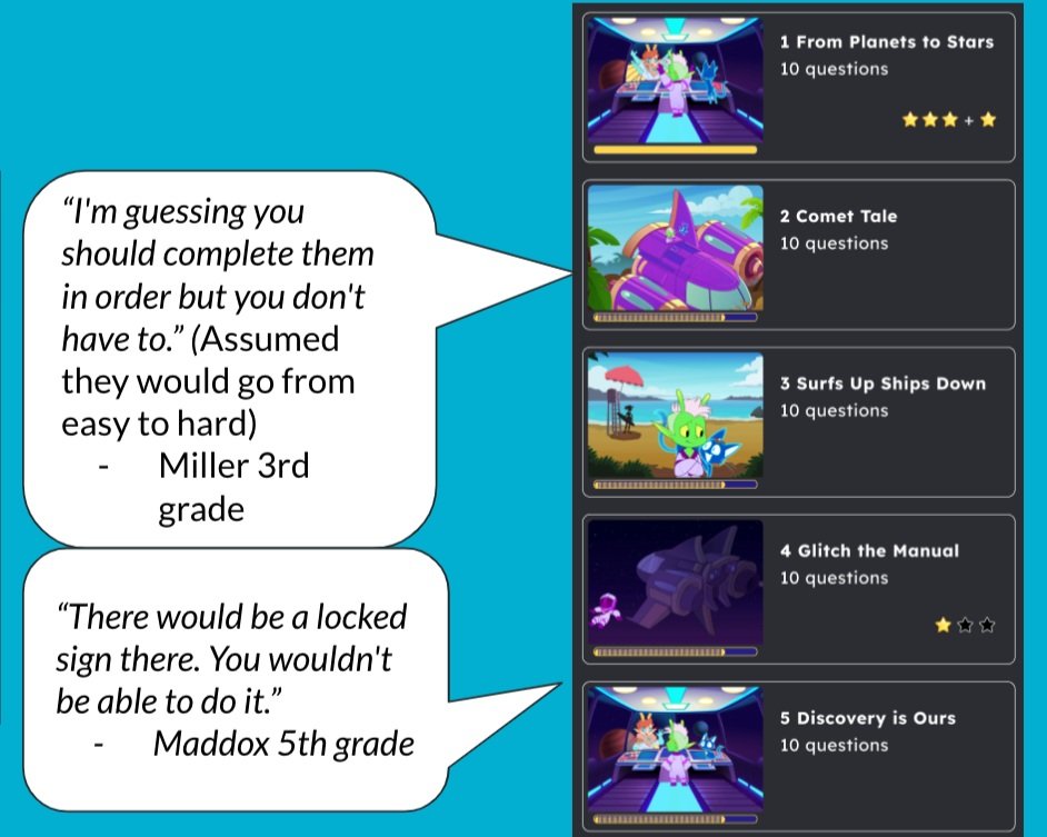


User testing takeaways:
Students needed more information in order to decide if they wanted to start over or continue
They didn’t understand the stars
Next steps:
After the first user test I hosted a design session with the team where we collaborated in solving the problems in a 2 hour timed meeting. It ran really smoothly.
Preview screen changes:
After user testing and the design workshop we came to these changes and went to high fidelity which Liz worked on.


Series screen changes:


Next Step
I designed the assignments feature where teachers could assign microlessons. I designed and tested where they would find the assignments and what they would look like after they had been assigned in various parts of the program.